BaseStation - AI powered Document Walkthrough Platform
Real estate agents, loan officers, and document-heavy professionals were spending countless hours in repetitive explanation cycles. Each client required the same document walkthrough, the same answers to common questions, and the same clarifications about form fields.
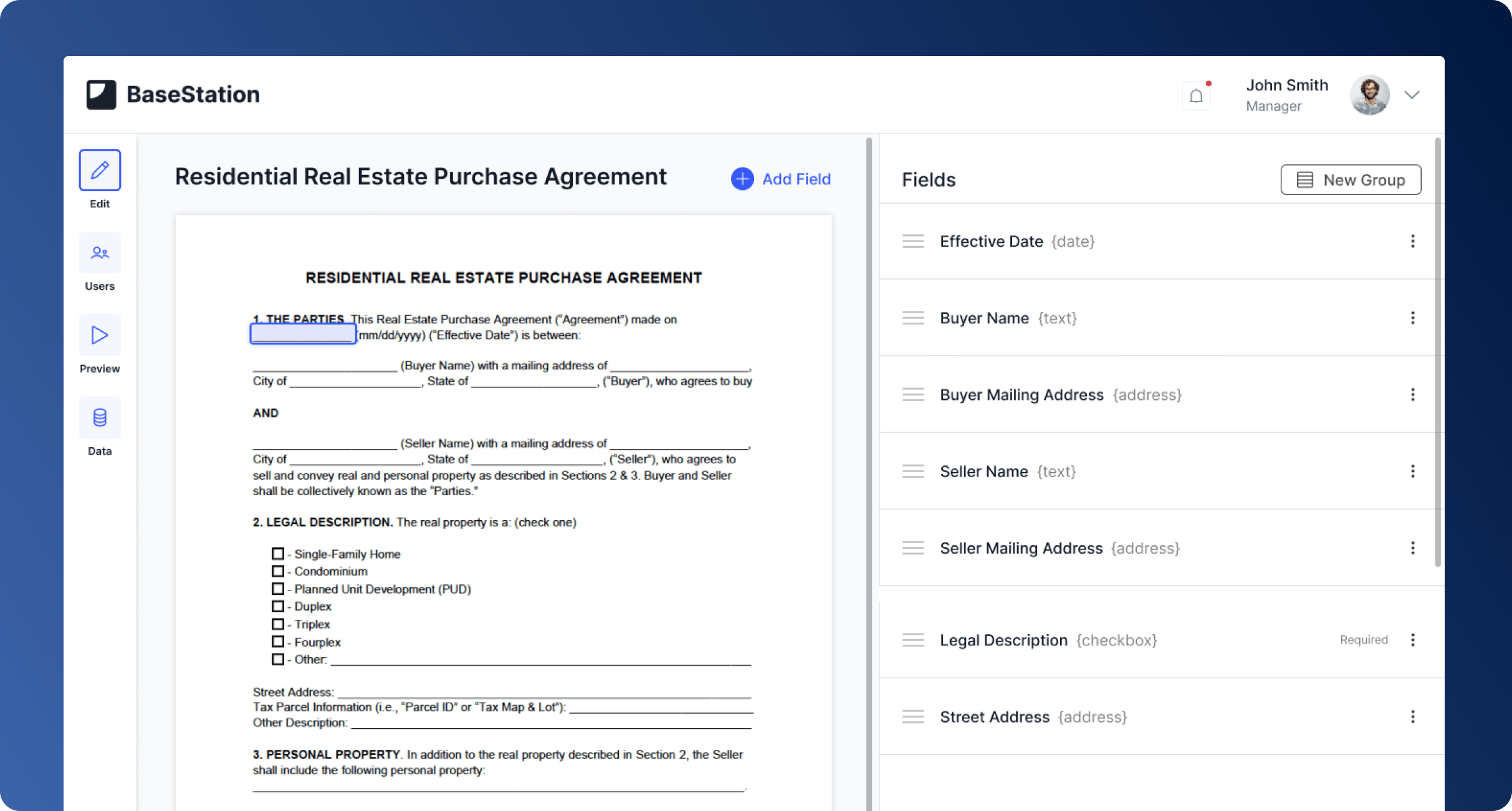
Transform static PDFs into interactive experiences
BaseStation invisioned a platform that would transform static PDFs into interactive, annotated experiences. The founder was actively talking with prospective users like real estate agents and loan officers who wanted to "record once, share forever." The solution had to work for two different user types:
Document Creators
Needed powerful annotation tools without technical complexity. They wanted to add video explanations, group related fields, create templates for repeated use, and customize for specific clients.
- Upload PDFs and forms
- Add text, audio, and video annotations
- Create reusable templates
- Customize for specific clients
- Organize and group related fields
Document Receivers
Needed clear guidance without feeling overwhelmed. They had to understand what each field meant, get help when needed, and complete forms with confidence.
- Understand what each field means
- Access help when needed
- Watch, listen, or read explanations
- Complete forms with confidence
- Not feel buried in dense information
Two Document Types for Different Needs
Early on, we identified that users needed two distinct workflows. Some documents required clients to fill in data (Forms), while others just needed explanatory annotations (Documents).
Forms
Interactive PDFs with fillable fields. Users can complete information directly in the browser with guidance for each field.
Documents
Read-only PDFs with annotations. Perfect for contracts, guides, or information that needs explanation but not modification.
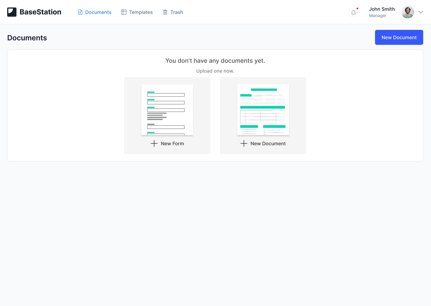
First-time users choose between creating a Form or Document
Multi-Format Annotation System
Flexible Content Types
Different people learn differently. Supporting text, audio, and video meant professionals could explain in the way that felt natural, and clients could consume in their preferred format.
Text Annotations
Quick explanations, definitions, or clarifications. Perfect for simple field instructions.
Audio Recordings
Voice guidance for more personal touch. Users could record explanations on the fly.
Video Walkthroughs
Screen recordings or face-to-camera explanations for complex topics requiring visual demonstration.
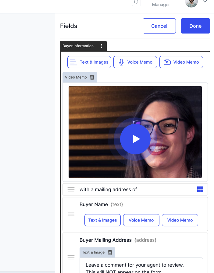
Organizing Complex Documents
Real estate contracts and loan documents often have dozens of related fields scattered across multiple pages. We designed a field grouping system that let creators organize logically related fields together, making the experience more coherent for document receivers.
Key Features
- Drag and drop to reorder fields
- Group related fields (e.g., "Buyer Information", "Property Details")
- Add section-level annotations
- Preview how receivers will navigate the grouped fields
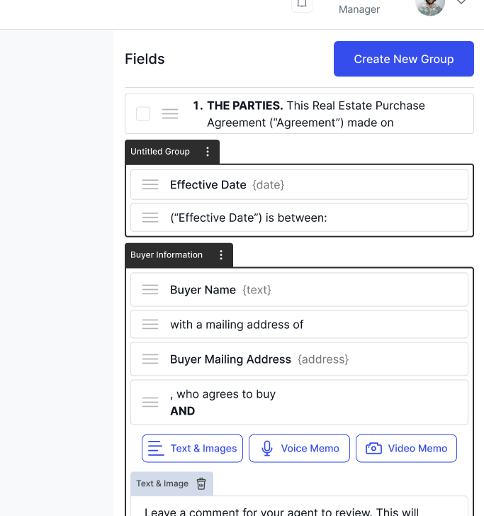
Rethinking Annotation Placement
We had placed annotations inline with document fields, thinking proximity would help users understand each field better. Instead, users reported that forms felt "long."
I explored multiple solutions including: comment-style annotations like Google Docs, floating tooltips, and ultimately a side-panel approach inspired by YouTube's related videos. The side panel made sense because it let users see all annotations at once, jump between them freely, preserved the document's visual structure, and worked better on mobile devices.
Before: Inline Annotations
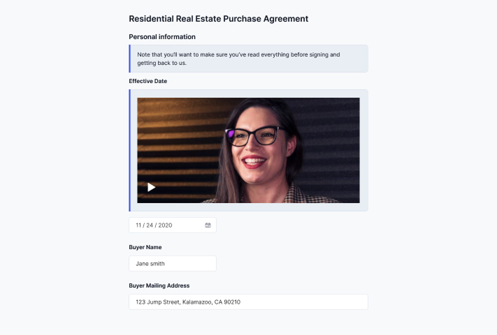
Forms felt endless as annotations extended the page length. Users couldn't see the full document structure.
After: Side Panel
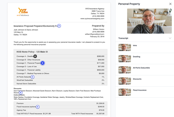
All annotations visible at once. Users could jump between guidance, see document structure, and work on mobile.
Process & Collaboration
I worked directly with the founder in a tight feedback loop. He was actively engaging with prospective users testing the concept. We used whiteboarding sessions to explore information architecture and sketch interaction patterns. I created Figma designs and prototypes that he could share with potential users, incorporating feedback in rapid cycles.
The startup environment required every feature had to balance user value against development complexity. Timeline constraints and technical feasibility shaped the MVP scope, but we prioritized getting real user feedback over polish. This approach let us discover the inline annotation issue early enough to fix it before development.
The founder's direct access to users was invaluable, though I would have benefited from observing actual document receivers completing forms. That direct observation would have identified friction points even earlier and validated solutions faster.
