Led the comprehensive redesign of the California Institute of Technology (Caltech) website to modernize their digital presence and better showcase their world-class research. As Lead Designer at KWALL, I orchestrated a research-driven approach that transformed an outdated website into a contemporary platform that effectively communicated Caltech's distinguished academic reputation and scientific achievements. The project balanced the unique positioning of Caltech as 'a research institute that happens to have students' while creating an engaging user experience that highlighted their groundbreaking work.

Process & Approach
Research & Discovery
Conducted thorough site analysis and Google Analytics review to identify improvement opportunities and user behavior patterns. The analytics revealed significant international traffic and high engagement with research articles, informing our content strategy. We explored the campus to draw inspiration from architecture and visual elements, while collaborating with stakeholders to understand institutional goals and user needs. This discovery phase established the foundation for a design that would authentically represent Caltechs identity.
Information Architecture
Facilitated sitemap workshops with the Caltech team to restructure content organization and create a more intuitive navigation system. Through collaborative sessions, we developed a logical menu structure that balanced institutional priorities with user needs. This process involved multiple revision cycles to ensure the information architecture would effectively serve both internal stakeholders and external audiences, particularly prospective students and the scientific community.
Wireframing & Prototyping
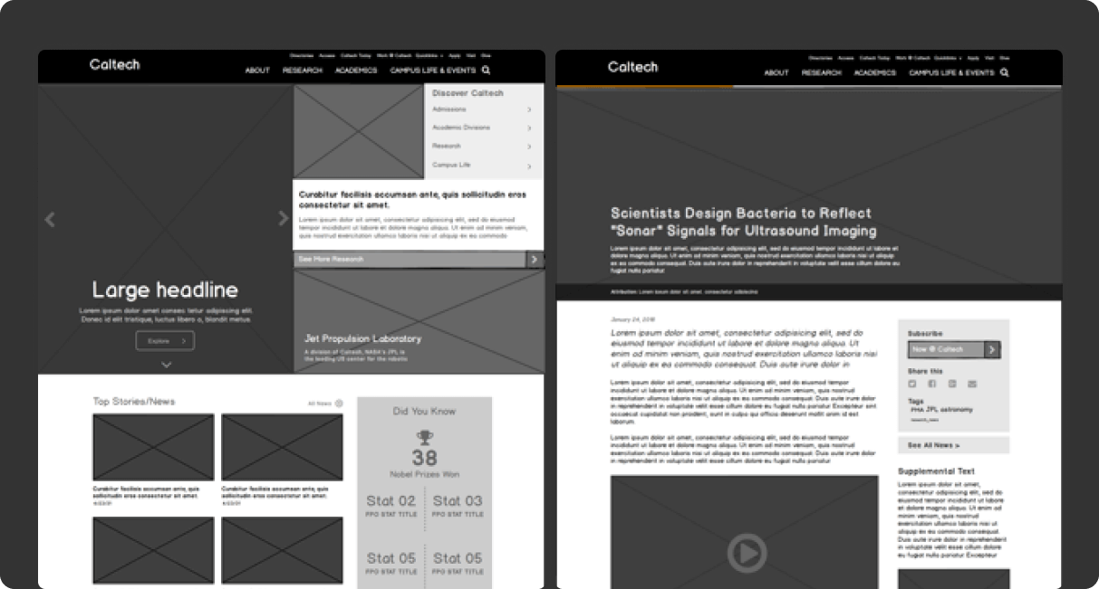
Developed comprehensive wireframes using Balsamiq to focus purely on content structure and user flows without the distraction of visual design elements. Conducted biweekly review sessions with the Caltech team to refine layouts and functionality. Used InVision to create interactive prototypes that allowed stakeholders to experience the proposed navigation and content organization, facilitating productive feedback cycles and collaborative refinement.
Visual Design System
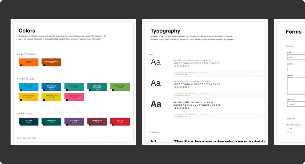
Created a modern visual language that honored Caltech's prestigious heritage while bringing a contemporary aesthetic to their digital presence. Addressed accessibility challenges with their orange-dominant brand colors by developing compliant color combinations that maintained brand recognition. Incorporated editorial design principles from their print materials to ensure consistency across channels, while introducing new digital-specific elements to enhance the online experience.
Documentation & Handoff
Produced comprehensive design specifications and documentation to ensure successful implementation by Caltech's development team. Created a 60+ page outline detailing spacing, attributes, and functionality for all design elements. Developed a streamlined style guide with HTML and CSS components that functioned as a mini design system, documenting colors, typography standards, input styles, and reusable components to maintain design integrity throughout implementation.

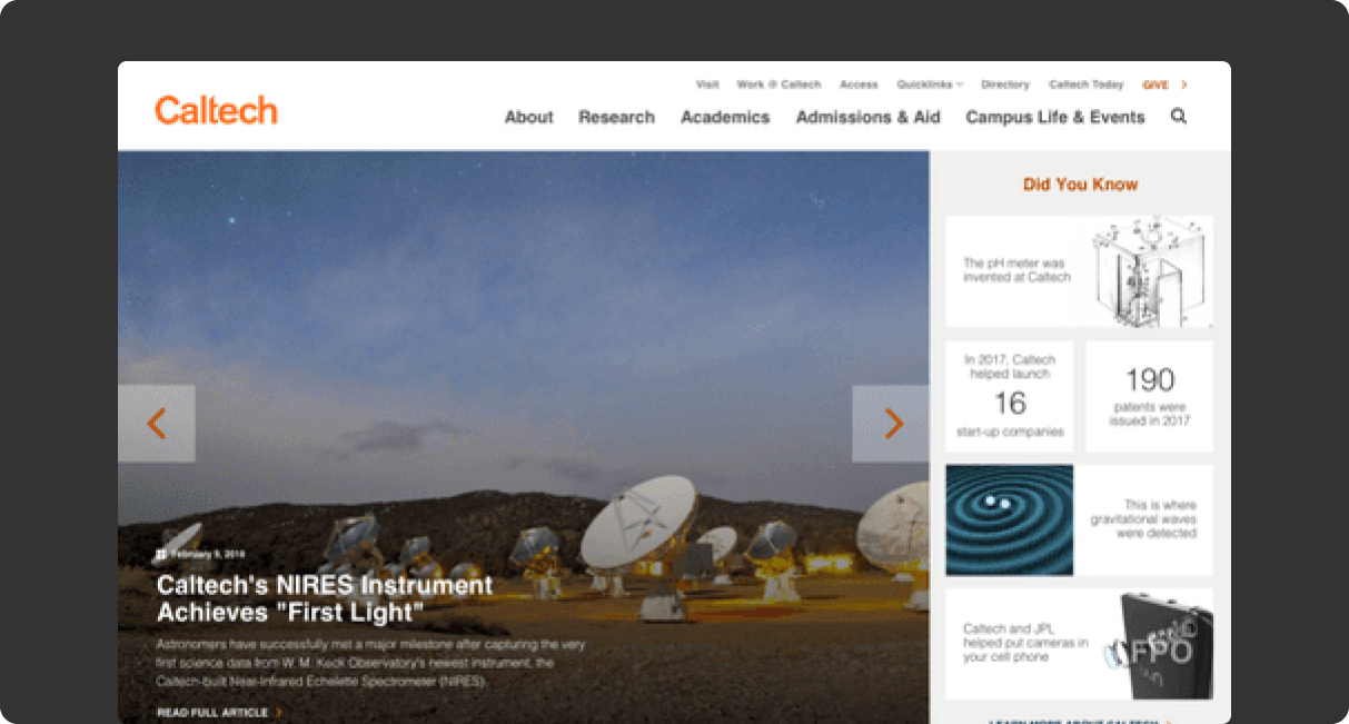
Redesigned homepage showcasing research prominence and institutional identity

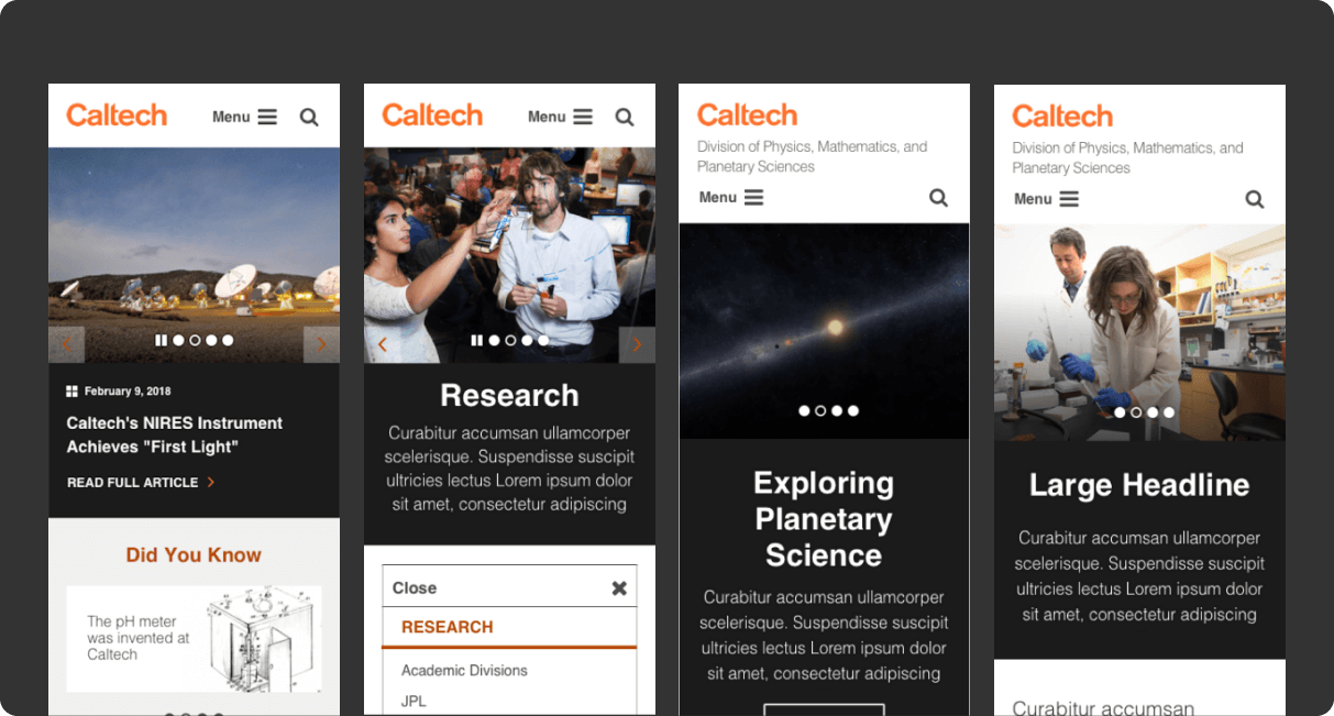
Mobile-responsive layouts optimized for on-the-go access to research and news

Component-based style guide ensuring design consistency across the site

Iterative wireframing process focused on content structure and user journeys
Design Challenges
Balancing Institutional Identity
Caltech's positioning as "a research institute that happens to have students" created a unique design challenge. We needed to showcase their world-class research prominently while still addressing the needs of prospective and current students. This required thoughtful content prioritization and information architecture that reflected this distinctive institutional character while serving diverse audiences effectively.
Accessibility Compliance
Caltech's brand identity featured orange prominently, which posed accessibility challenges for web implementation. We conducted extensive color testing to develop accessible combinations that maintained brand recognition while ensuring WCAG compliance. This process involved careful adjustment of color values, contrast ratios, and application contexts to create an inclusive experience without compromising the established visual identity.
Third-Party Implementation
Since KWALL was responsible for design but not development, we needed to create exceptionally thorough documentation to ensure successful implementation. This required anticipating implementation questions and providing detailed specifications that would translate our design intent accurately. The comprehensive style guide and component documentation we developed bridged the gap between design and development teams, ensuring design integrity throughout the build process.
