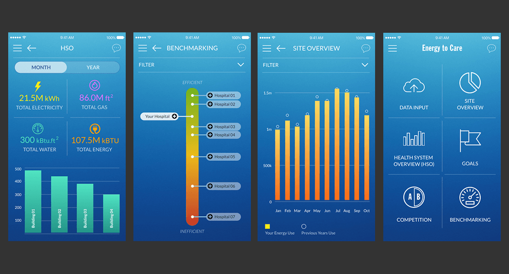
Designed a conceptual energy monitoring application for medical facilities to track consumption, compare performance across healthcare systems, and receive optimization recommendations. Created for a funding presentation, this project required a visually striking design that would excite stakeholders while demonstrating practical utility.
Company
Stealth startup
Role
Contract Designer
Timeline
1 month

Key Features
Centralized Information Dashboard
Addressed the challenge of information fragmentation by designing a unified dashboard that provided immediate access to six key information areas. Incorporated a communication feature in the upper right corner to facilitate collaboration between facility managers and sustainability teams. This centralized approach eliminated the previous siloed information structure and created a single source of truth for energy management.
Monthly & Yearly Performance Monitoring
Created interfaces for tracking current-month and year-to-date performance metrics, using a budgeting metaphor familiar to facility managers. Designed comparative visualizations showing real-time energy consumption relative to targets, helping managers identify trends and make timely adjustments. The system prioritized current-month views to enable immediate corrective action before issues affected annual goals.
Visual Goal Tracking
Transformed traditional spreadsheet-based goal tracking into visually engaging progress indicators. Designed graphics that provided at-a-glance status updates on energy conservation targets with supporting statistics. Created comparison features that enabled managers to set appropriate benchmarks by analyzing peer performance data, fostering healthy competition and innovation across facilities.
Design Process
Rapid Problem Identification
Despite the limited timeline, I collaborated with product and engineering leads to quickly identify four core problems in existing energy management workflows: fragmented information access, difficulty tracking current performance, limited comparative analysis capabilities, and ineffective goal visualization. These pain points became the foundation for feature prioritization and design focus.
Visual Exploration
The stakeholders requested a design that would stand out in a 2017 context while remaining functional. I developed a visual language that balanced forward-thinking aesthetics with practical information hierarchy, using vibrant colors and distinctive UI elements that would capture attention in a presentation context while demonstrating usability.
Prototype Development
Using Sketch for UI design and ProtoPie for interactions, I created a functional prototype that demonstrated the app's core capabilities. The prototype focused on showing the relationship between different screens and how users would navigate between key features. This interactive model was critical for helping stakeholders visualize how the application would function in real-world scenarios.
