Kivo Health: Reducing Manual Work by 80%
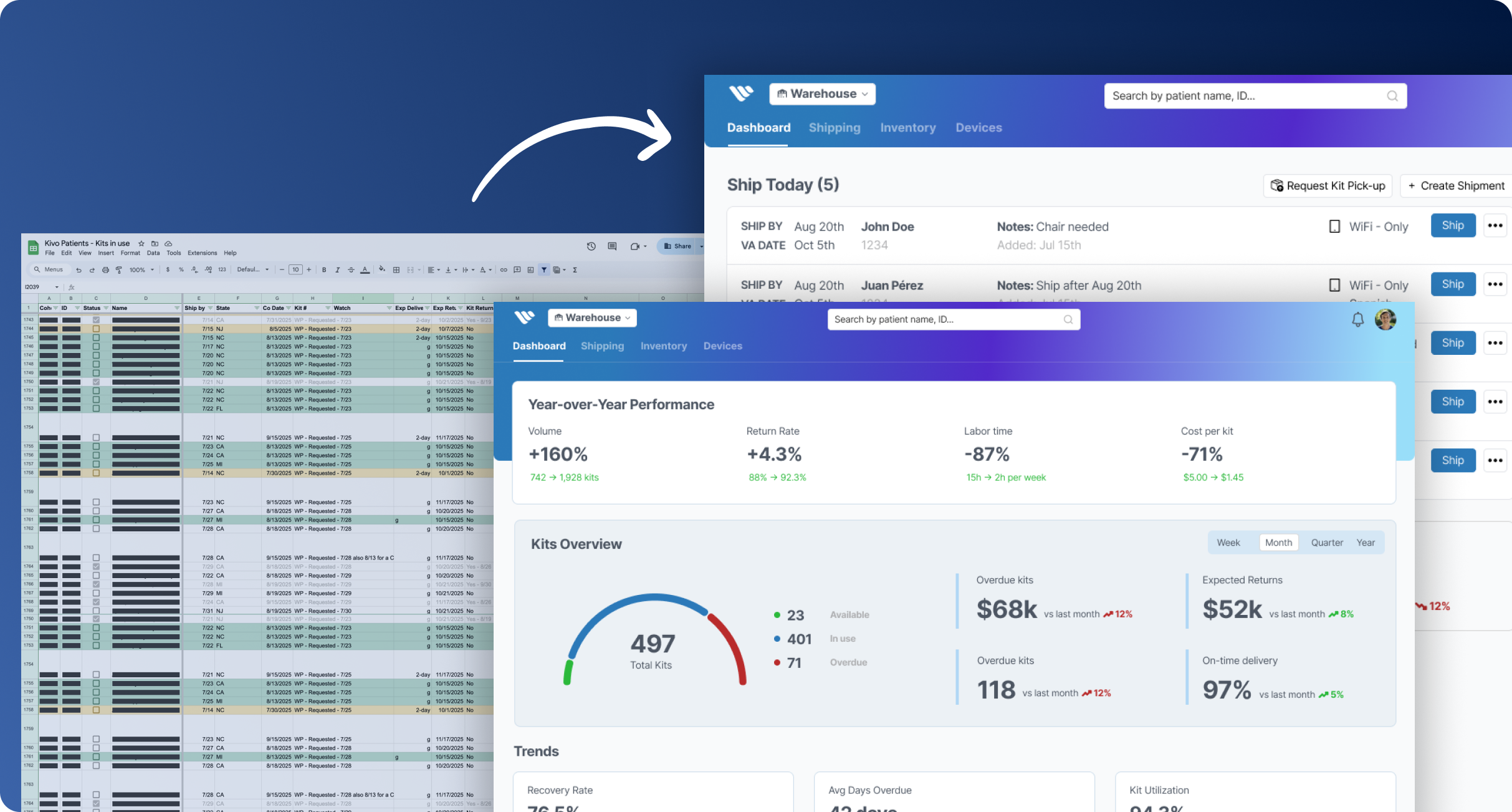
Creating visibility and reducing coordination overhead. Transforming a 2,062-row spreadsheet into an action-oriented dashboard that reduced manual work from 15 hours/week to 3 hours/week.
Understanding the Problem
Kivo Health provides telehealth pulmonary rehabilitation for COPD patients, shipping comprehensive kits containing iPads, medical devices, exercise equipment, and educational materials directly to patients' homes. Each kit contains 25+ individual components that need to be tracked and managed.
As the program scaled from 24 kits/month to 100+, the manual coordination system was breaking down. Before designing any solution, I interviewed the warehouse manager to document the end-to-end kit preparation and fulfillment process.
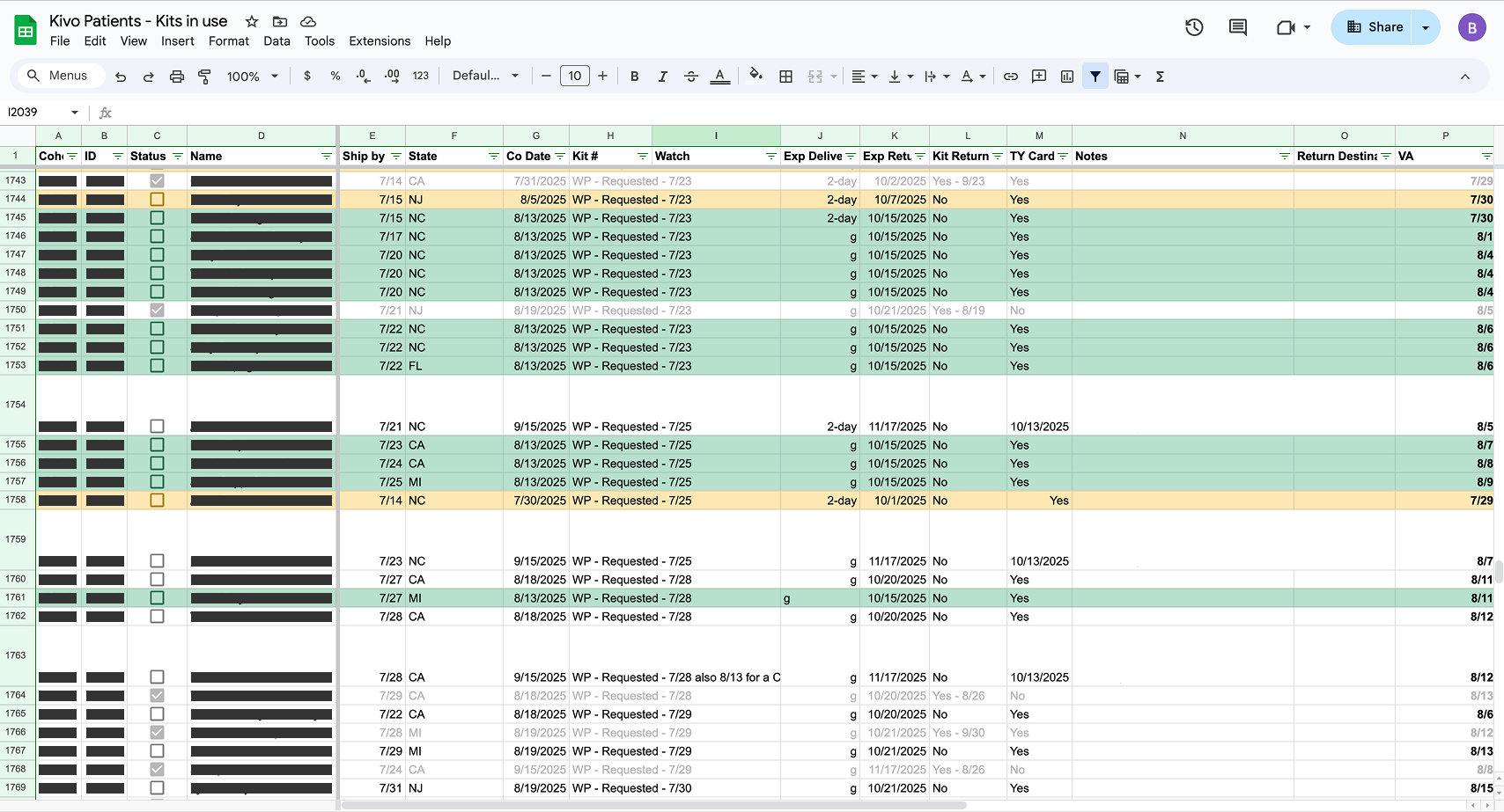
The coordinator managed everything through a 2,062-row spreadsheet and manual processes across disconnected systems. 15+ hours per week spent on data entry, copy-paste work, and tracking.

I created a comprehensive Figjam diagram mapping each step, system touchpoint, and data flow. Walking through this visual workflow with the team revealed the complexity hidden beneath the simple request: "Ship a kit to a patient."
- Manual bottlenecks - Kit requests via Slack → copied to spreadsheet → manually entered into Admin system (31 clicks) → warehouse shipping request created (12 clicks)
- Redundant data entry - Same patient information entered across 3+ systems
- System disconnects - Waiting for warehouse emails for iPad serial numbers, manually checking UPS website for delivery status, tracking inventory via periodic warehouse emails
- Cognitive overload - Mentally scanning 2,000+ spreadsheet rows to identify urgent work
This workflow mapping became the foundation for our phased improvement approach, helping us prioritize which pain points to address first.
Phase 1: Foundation - Visibility & Organization
Goal: Replace spreadsheet with searchable, action-oriented dashboard

Key Design: Three-Tab Architecture
Instead of one overwhelming list, I created three distinct views optimized for different needs:
TODAY Tab - Action-Oriented
Purpose: "What needs my attention RIGHT NOW?"
UPCOMING Tab - Pipeline View
Purpose: "What's coming in the next 1-4 weeks?"
ALL Tab - Complete Archive
Purpose: Historical lookup, reporting, return tracking
- Advanced filters: Status, Date range, State, Return status, Search
- Quick stats: "Total: 1,956 kits | 1,438 returned"
Phase 2: Tracking Integration
Goal: Stop manually checking UPS and waiting for warehouse emails. With the foundation in place, we added integrations to pull in data automatically.
UPS Tracking Integration
Before:
Manual process of copy tracking number → open UPS website → paste → check status → copy status → paste to spreadsheet. Time: 3 minutes per kit × 5-10 kits/day = 15-30 min/day.
After:
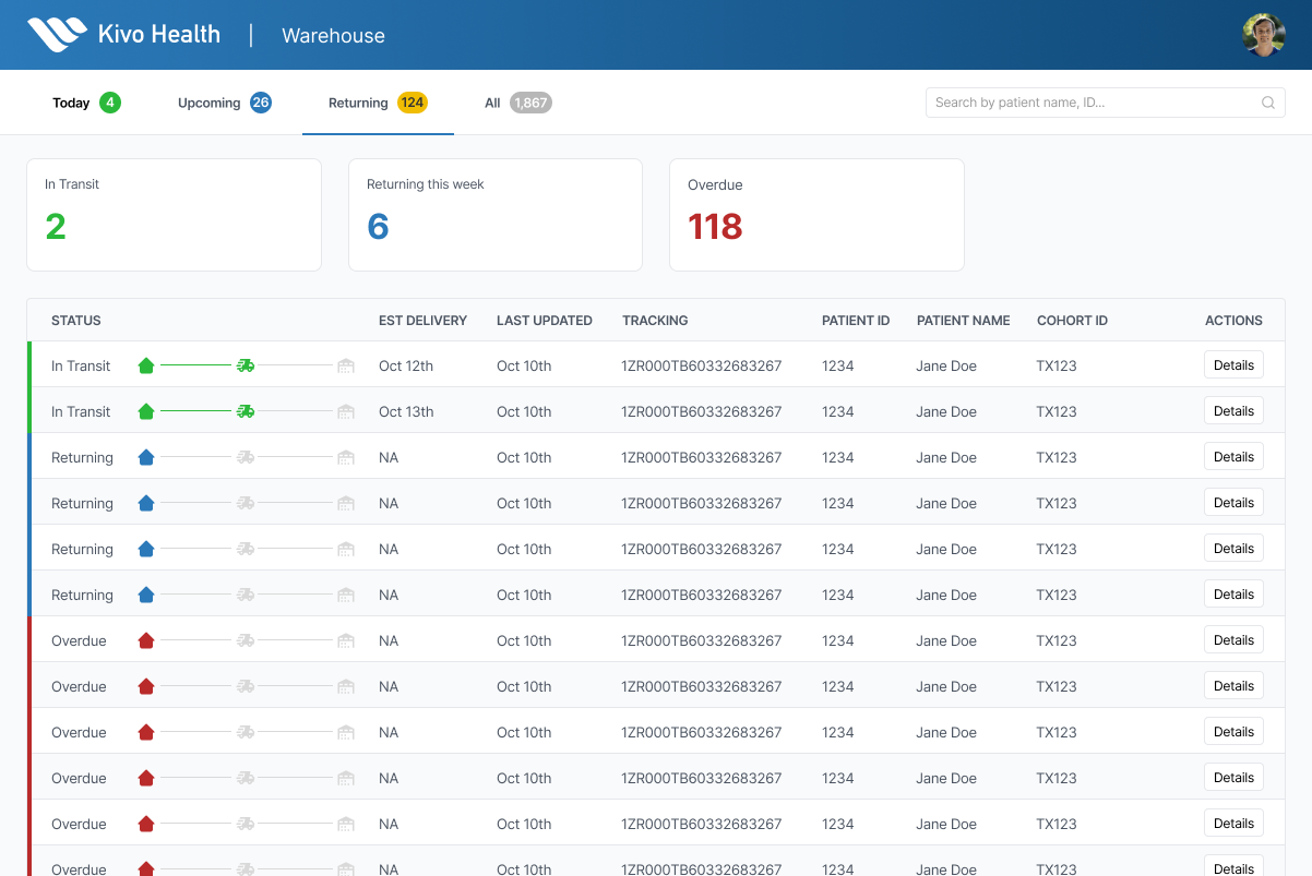
Dashboard checks UPS API every 4 hours automatically. Status updates appear in dashboard without manual work. Visual timeline shows: Shipped → In Transit → Delivered.
Kit Return Visibility
This is where I focused on visibility, not automation.
Key point: This doesn't automate the outreach (that's still manual calls, texts, or physical letters). But it makes it visible who needs follow-up without manual spreadsheet scanning.
Phase 3: Role-Based Views
Goal: Optimize the interface for different user roles and workflows.
From early conversations, we recognized that coordinators and executives needed different information. However, we deliberately focused Phases 1-2 on the coordinator workflow since they were the primary daily user drowning in manual work. Once we had a proven foundation that worked for their needs, Phase 3 optimized the interface for different stakeholder roles.
The coordinator needed task-level operational details (what to ship today, which items are low stock), while executives needed high-level program metrics (return rates, financial impact, trends).
Evolution of Views
Phase 1 "Today" tab showed all urgent kits in a single table. Phase 3 Coordinator view breaks this into specialized sections: shipping table, automated tasks, and inventory alerts. Same information, but organized by workflow rather than just urgency.
We created two specialized views optimized for each role's daily workflow.
Coordinator View
Daily operational tasks and inventory management
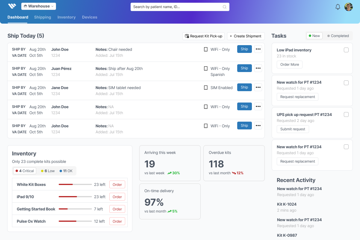
Built for the coordinator's workflow: ship kits, manage inventory, and respond to automated alerts. Unlike the Phase 1 "Today" tab which showed a single prioritized list, this view separates concerns into dedicated sections.
Key Features
Quick Shipping Table
Key details for when to ship, patient details and what to ship.
Tasks Tracking
Dedicated section showing unique one off requests or automated tasks for inventory replenishment.
Inventory Tracking
Tabbed card with highlights for critically low, low, and ok inventory supply levels.
Executive View
Strategic oversight and program health metrics
While the coordinator needs task details, executives need the opposite: aggregated metrics and trends. This view surfaces program health and financial impact without operational noise.
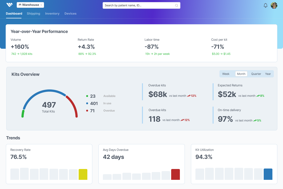
Key Metrics
Program Health Overview
Top-level cards showing: Active Kits (497), Overdue Value ($68,625), Return Rate (76.5%). Color-coded trends: ↑ green for improving, ↓ red for declining.
Impact Tracking
Monthly view of kit inventory value at risk: "Outstanding: $68K | Expected Returns (30 days): $52K | Kit Utilization: 94.3%.
Impact & Outcomes
| Metric | Before | After | Improvement |
|---|---|---|---|
| Time per kit request | 2 minutes | ~30 sec | -75% |
| Weekly admin time | 15 hours | 3 hour | -80% |
| Annual labor cost | ~$78,000 | ~$5,200 | -93% |
What I Learned
1. Visibility Alone Creates Value
The dashboard doesn't automate everything, but making information visible and organized is enormously valuable. Before, the coordinator had to mentally scan 2,000 spreadsheet rows to find urgent work. Now it's surfaced automatically. This cognitive load reduction is as valuable as automation.
2. Integration Beats Perfect Features
The Admin API integration eliminated copy-paste work entirely. This single integration had more impact than a dozen UI features. Similarly, UPS tracking integration eliminated 30 min/day of manual checking. Connecting systems is more valuable than perfecting interfaces.
3. Don't Automate What Requires Judgment
I initially planned to automate return follow-up emails. But user feedback revealed that patient communication requires context and judgment (some respond to calls, others to texts, others to physical letters). The dashboard should surface the need for follow-up, but the coordinator should decide the approach. Sometimes the best interface is information + manual action.
