
Kroger: Unifying Design Across 15+ Products
When I joined Kroger's supply chain division, 15+ internal applications were being built by independent teams with no shared design language. The corporate design system only covered customer-facing experiences. Internal tools were on their own. With no top-down mandate to enforce consistency, I took a grassroots approach: proving value team by team to earn adoption.
Building Credibility Through a Shared System
Earning developer trust without organizational authority
Kroger's corporate design system focused exclusively on customer-facing experiences. Internal supply chain applications, with their complex data tables, specialized navigation, and workflow-specific components, had no shared foundation. Every team was solving the same problems independently.
Without organizational authority to mandate adoption, I had to earn it. I started by identifying the teams with the most acute pain and working directly with their developers to build components that solved real problems they were already struggling with.
Key Components Developed
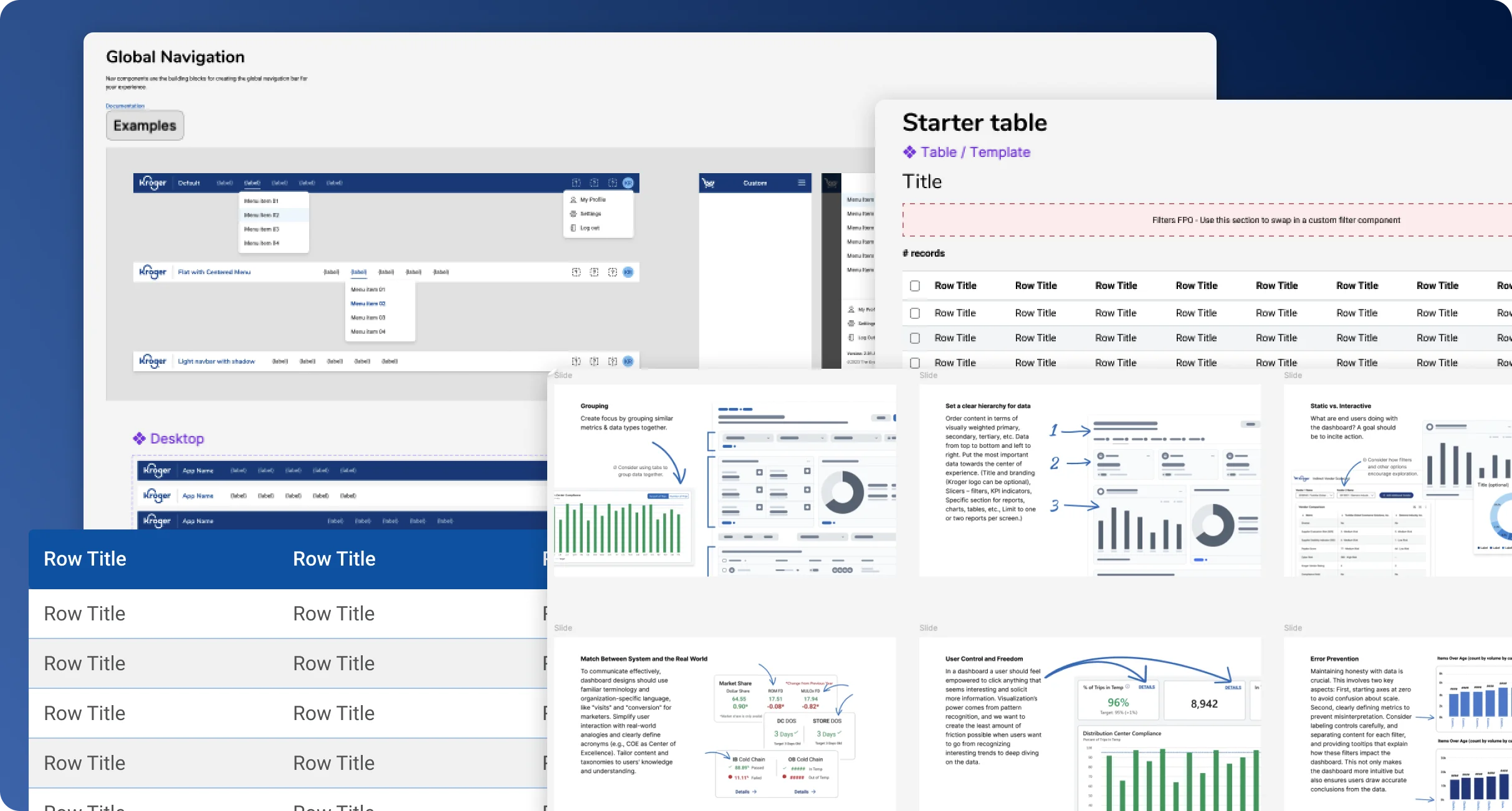
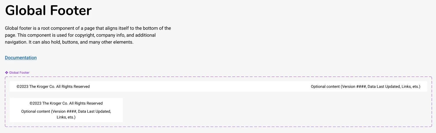
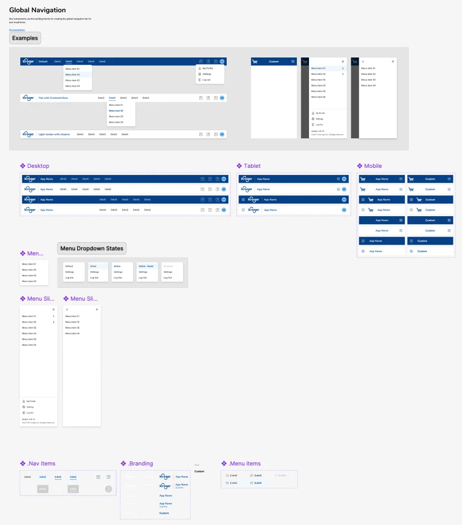
Global Navigation & Footer
Standardized navigation patterns optimized for internal tools, with consistent header structures and contextual footers across applications.
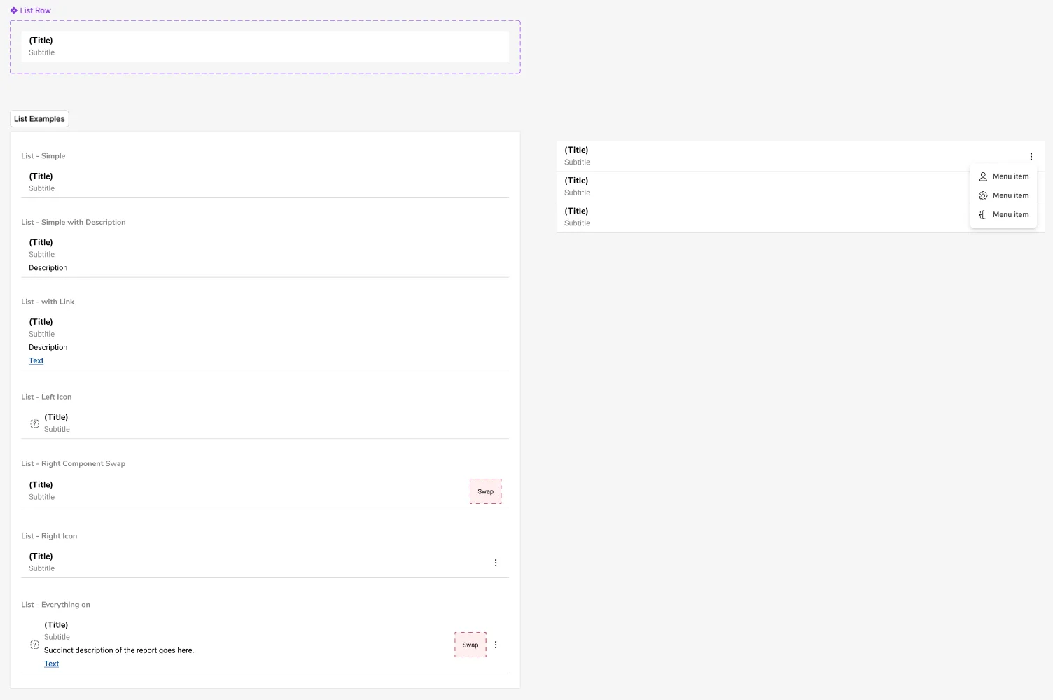
Data Tables & Lists
Complex table components with sorting, filtering, and bulk actions tailored to supply chain workflows, handling inventory data, order tracking, and warehouse operations.
Interactive Components
Form inputs, modals, alerts, and other UI elements specifically designed for web-based internal applications with high data density.
Implementation & Adoption
With limited organizational support, we took a grassroots approach to implementation. I worked directly with development teams to:
- Set up an internal Storybook instance hosting functional React components
- Document component usage, props, and best practices for developers
- Make components consumable via npm for other teams to integrate
- Collect feedback from early adopters and iterate on component APIs
How Grassroots Adoption Worked
Grassroots adoption is slower than top-down mandates, but the buy-in is stronger. Teams chose to adopt because the system solved their problems, not because they were told to. The approach:
- Started with pain points - Identified gaps between the corporate system and what supply chain teams actually needed
- Built with developers, not just for them - Designed components in Figma, then worked directly with devs to implement in Storybook with proper documentation and npm packaging
- Let early adopters sell it - Teams that adopted first became advocates, pulling other teams in organically
- Maintained the feedback loop - Collected input from designers and developers across teams to iterate on component APIs and patterns
Enabling Non-Designers to Design Well
A guide that scaled design thinking beyond the design team
Many supply chain teams relied on dashboards to communicate with stakeholders, but most had no dedicated designer. They were building dashboards in PowerBI with no guidance on hierarchy, chart selection, or information architecture, and the results showed it.
Rather than try to design every dashboard myself (impossible at this scale), I focused on the higher-leverage move: creating a resource that would raise the baseline quality of every dashboard, regardless of who built it. I collaborated with several other designers to develop a comprehensive best practices guide.

Guide Contents
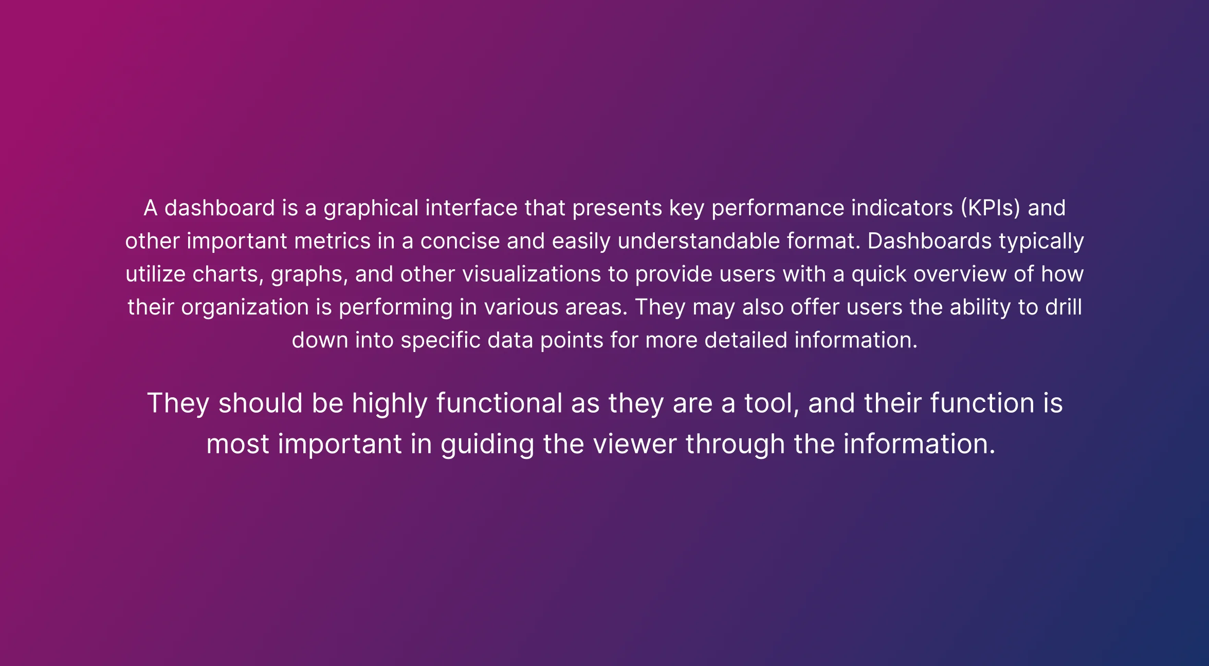
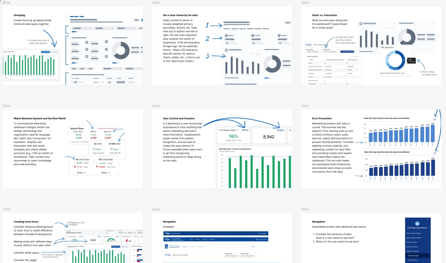
Dashboard Fundamentals
Core principles for effective dashboard design: clarity, hierarchy, relevance, and actionability. What makes a dashboard useful vs. just informative.
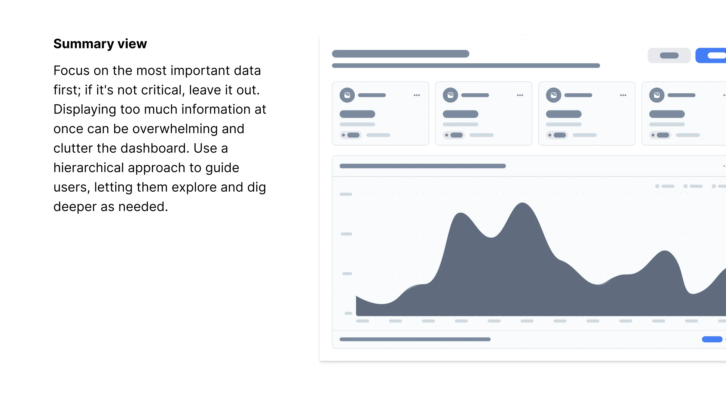
Layout & Information Architecture
How to structure information, create visual hierarchy, and guide users to key insights. Grid systems, spacing, and grouping patterns.
PowerBI-Specific Guidelines
Since many teams used PowerBI, we included specific callouts: recommended visualizations, interaction patterns, performance considerations, and common pitfalls to avoid.
Making Dashboards Actionable
Not just showing data, but enabling decisions. How to highlight anomalies, provide context, and surface next steps.

Impact
The guide became the go-to resource across the supply chain organization. Teams without designers could now produce dashboards that followed clear principles. But the bigger impact was cultural: it established a shared vocabulary for talking about dashboard quality. Instead of subjective feedback ("this doesn't look right"), teams had concrete guidelines to reference. Design influence scaled beyond what any individual designer could touch directly.
Standardizing Data Visualization
Creating a shared visual language for data across the organization
The dashboard guide addressed how to structure dashboards, but teams were still using inconsistent chart styles, color schemes, and visualization patterns. When executives pulled up dashboards from different teams side-by-side, the visual dissonance undermined trust in the data itself.
I created a foundational data visualization library: not just styling, but guidance on when to use each chart type, how to handle edge cases, and accessibility considerations for color palettes.
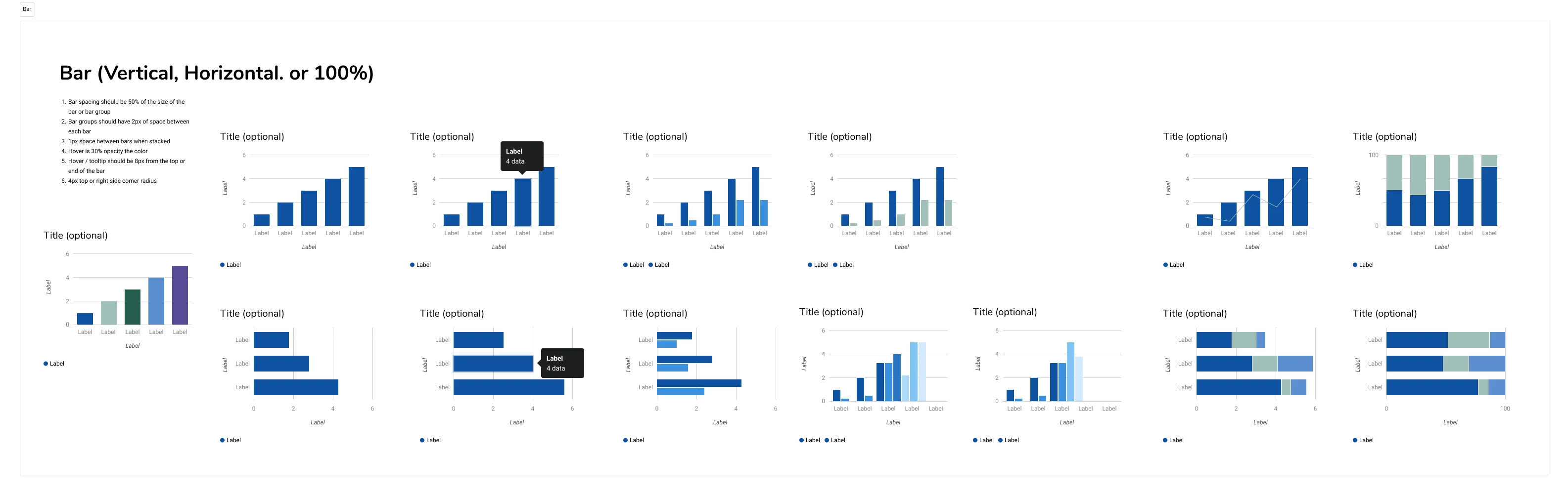
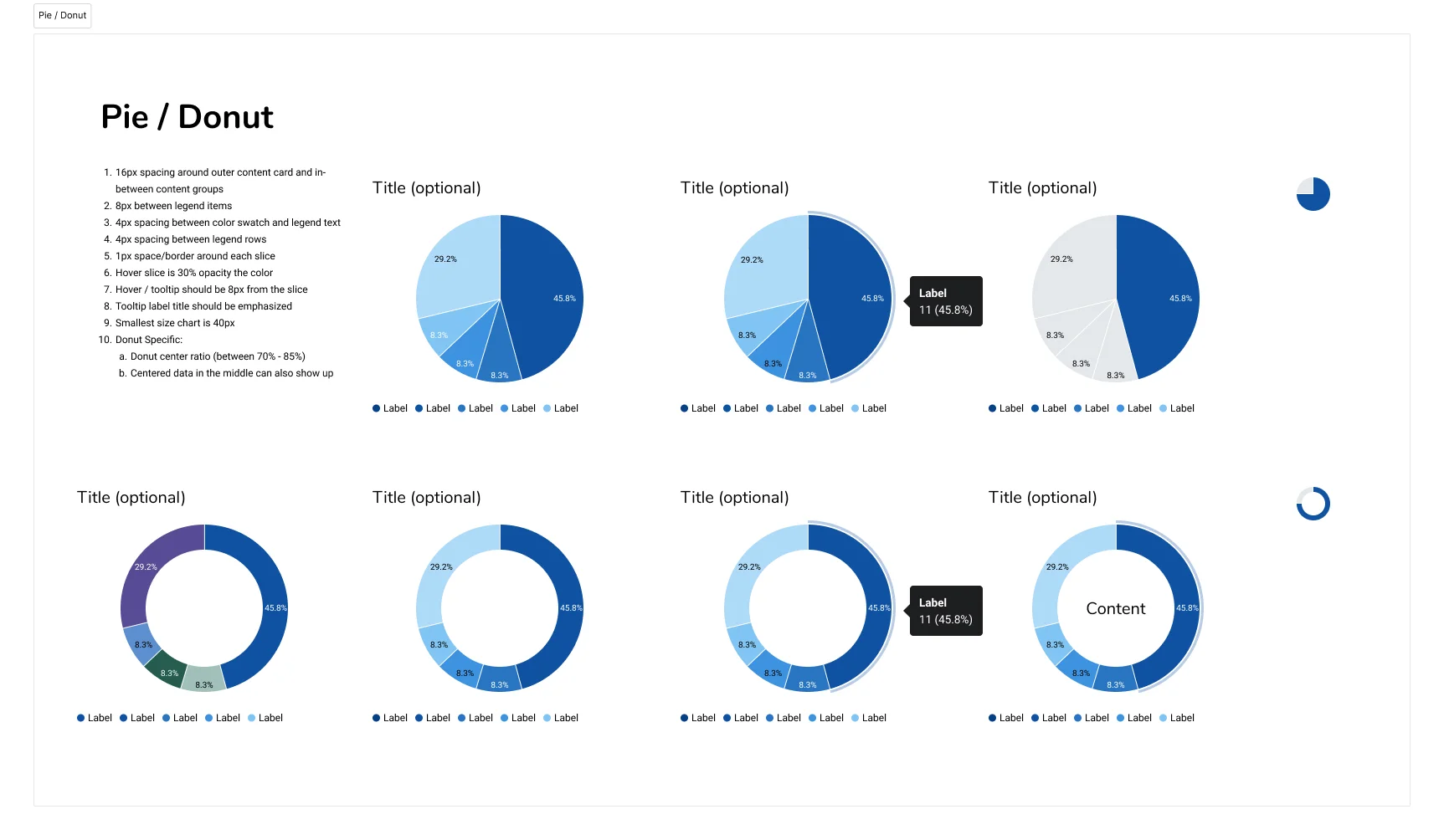
Library Components
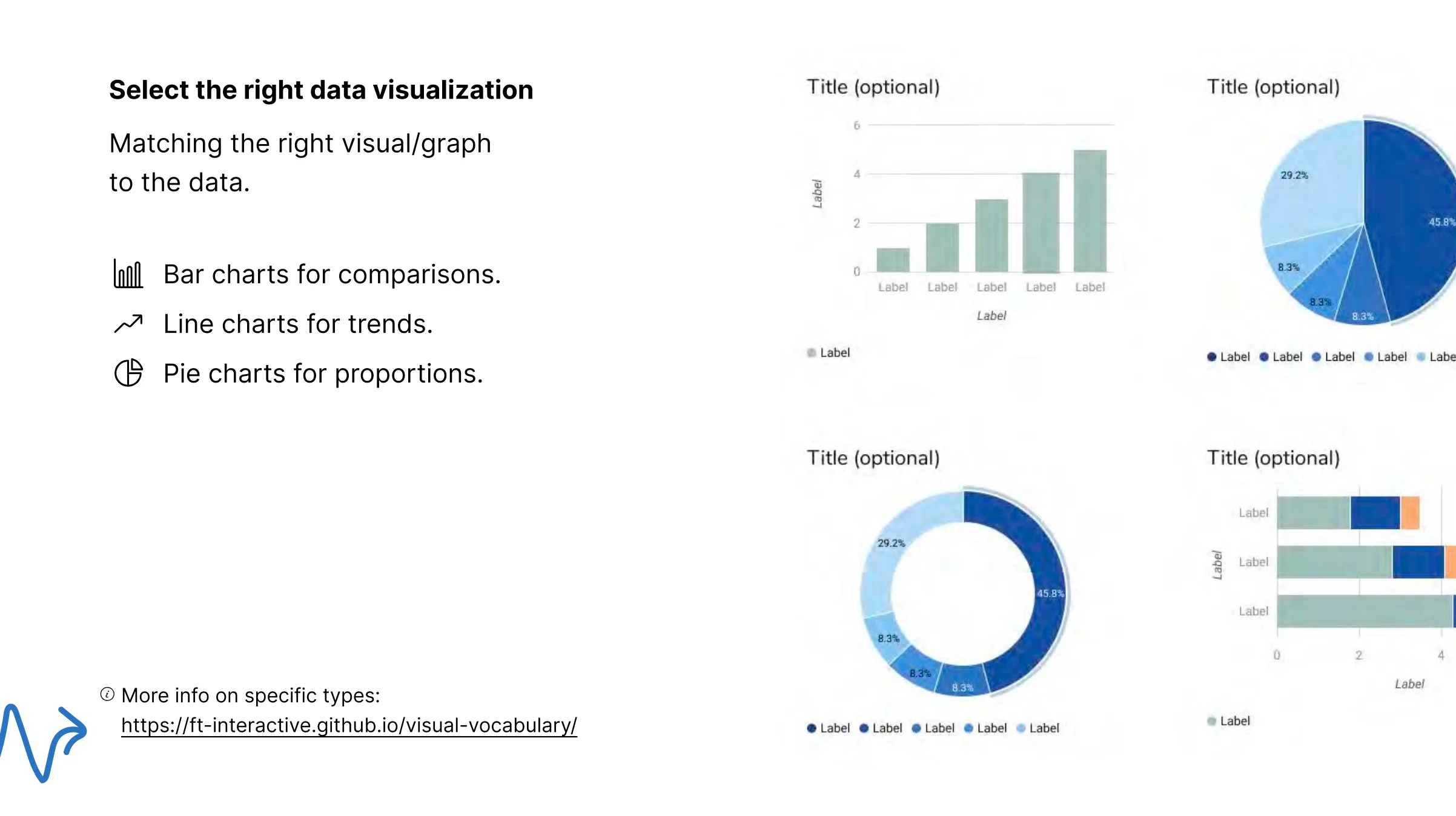
Functional Chart Templates
Built Figma components for common chart types (bar graphs, donut charts, line graphs) with proper proportions, spacing, and annotation patterns.
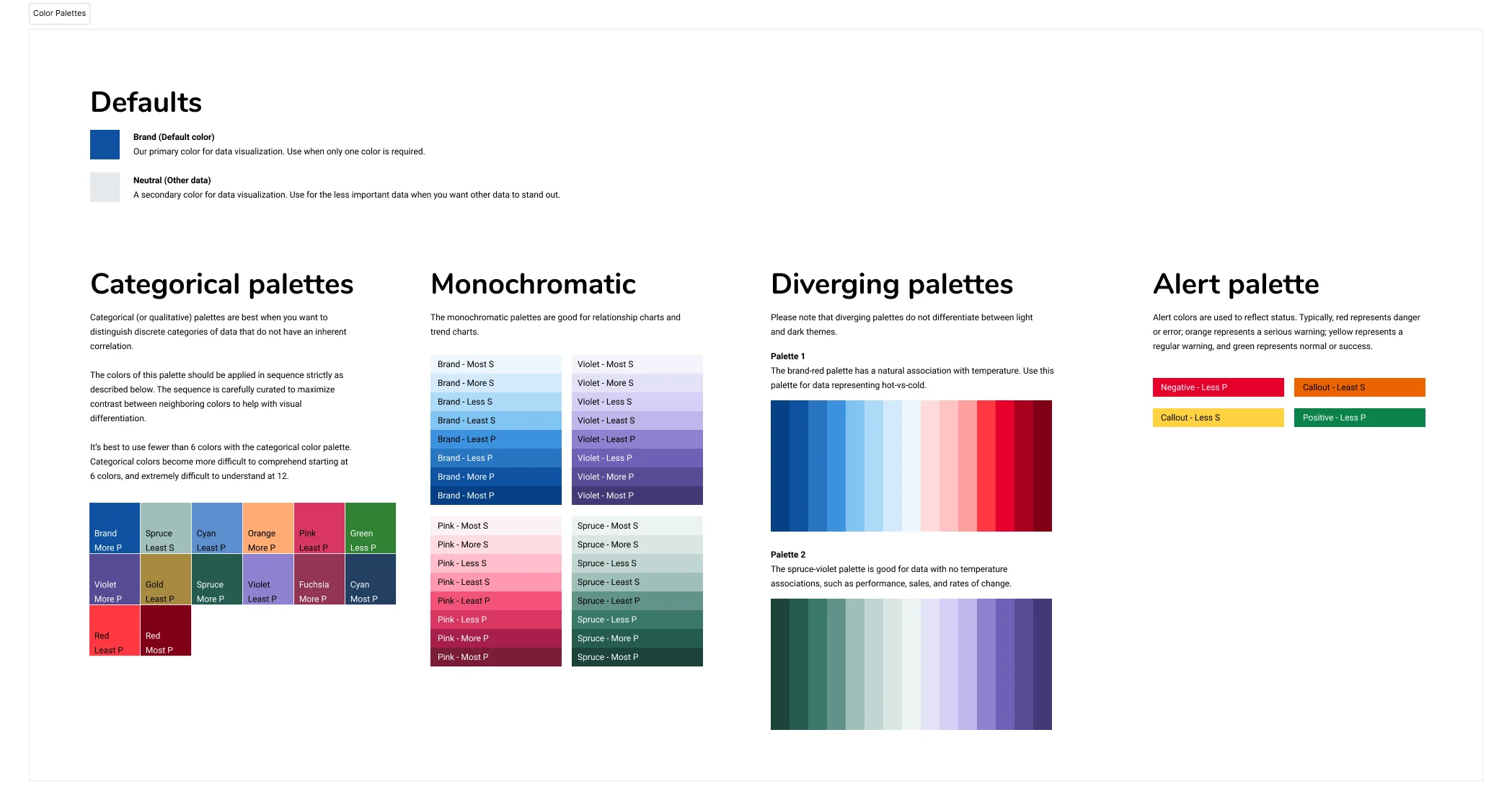
Color Palettes & Tokens
Established standardized color palettes for data visualization that balanced brand alignment with accessibility and clarity. Created Figma tokens for easy implementation.
Usage Guidelines
Documentation on when to use each chart type, how to handle edge cases, and best practices for labeling and legends.
This paired with the dashboard guide to give teams a complete toolkit: structural guidance for layout and hierarchy, plus a visual library for consistent chart implementation. Together, they formed a self-service design resource that scaled across the organization.
Finding the Pattern Inside the Chaos
How an audit of 15+ apps revealed a unification opportunity
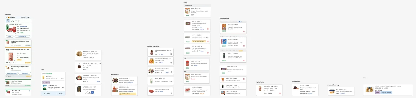
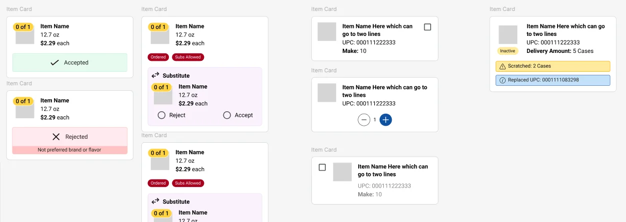
Every supply chain application displayed product information, but each team had built their own version of a product card in isolation. From the outside, it looked like chaos: 15+ implementations with different layouts, hierarchies, and interaction patterns.
Before proposing any solution, I needed to understand why each team had made different choices. I conducted a comprehensive audit across all applications to separate meaningful variation from accidental divergence.

What the Audit Revealed
The audit revealed something important: teams weren't being careless. They were solving real problems in isolation. The underlying information needs were remarkably similar. The differences came down to:
- Visual styling - Different spacing, typography, image treatments, and borders
- Information hierarchy - Same fields arranged in different orders
- Density - Some cards showing all information upfront, others being more minimal
- Actions - Inconsistent placement and styling of buttons and interactive elements
The opportunity was clear: we could create a unified component that would work across most use cases while improving consistency and reducing maintenance burden.
Unification Strategy
I developed a regional structure that could accommodate different information needs while maintaining visual consistency:
- Core regions - Image area, primary info, secondary details, actions
- Flexible content - Each region could show different fields based on context
- Progressive disclosure - Used Figma Make to prototype how less critical information could be revealed on interaction rather than shown upfront

Where This Was Heading
I developed a unification proposal and presentation for product teams, demonstrating how a flexible shared component could accommodate each team's needs while dramatically reducing duplication. The next phase would have been socializing the design and working with developers to build it. The work was cut short by layoffs, but the audit itself proved valuable. It gave the organization its first complete picture of how product information was handled across the ecosystem, and a clear path toward convergence.
What I Learned
1. Influence Without Authority Requires Proof, Not Arguments
No amount of presenting "best practices" would have convinced teams to adopt a shared system. What worked was building something that solved their immediate pain, putting it in front of them, and letting the results speak. The teams that adopted earliest became the most effective advocates. They pulled others in because they could point to real improvements, not theoretical benefits.
2. Designing for Builders Is a Different Skill
When your users are developers and designers, the success criteria changes. A component library isn't useful if the API is awkward. A best practices guide isn't useful if it reads like a lecture. I learned to treat internal tools and documentation with the same rigor I'd bring to a consumer product, because adoption is still voluntary, even inside a company.
3. Audit Before You Propose
My instinct with the product card was to immediately design a "better" unified component. Instead, I audited first, and discovered that what looked like inconsistency was often teams making reasonable tradeoffs for their context. The audit gave me credibility ("he understands our constraints") and produced a stronger solution because it accounted for real variation instead of assuming it away.