Orchid Finance
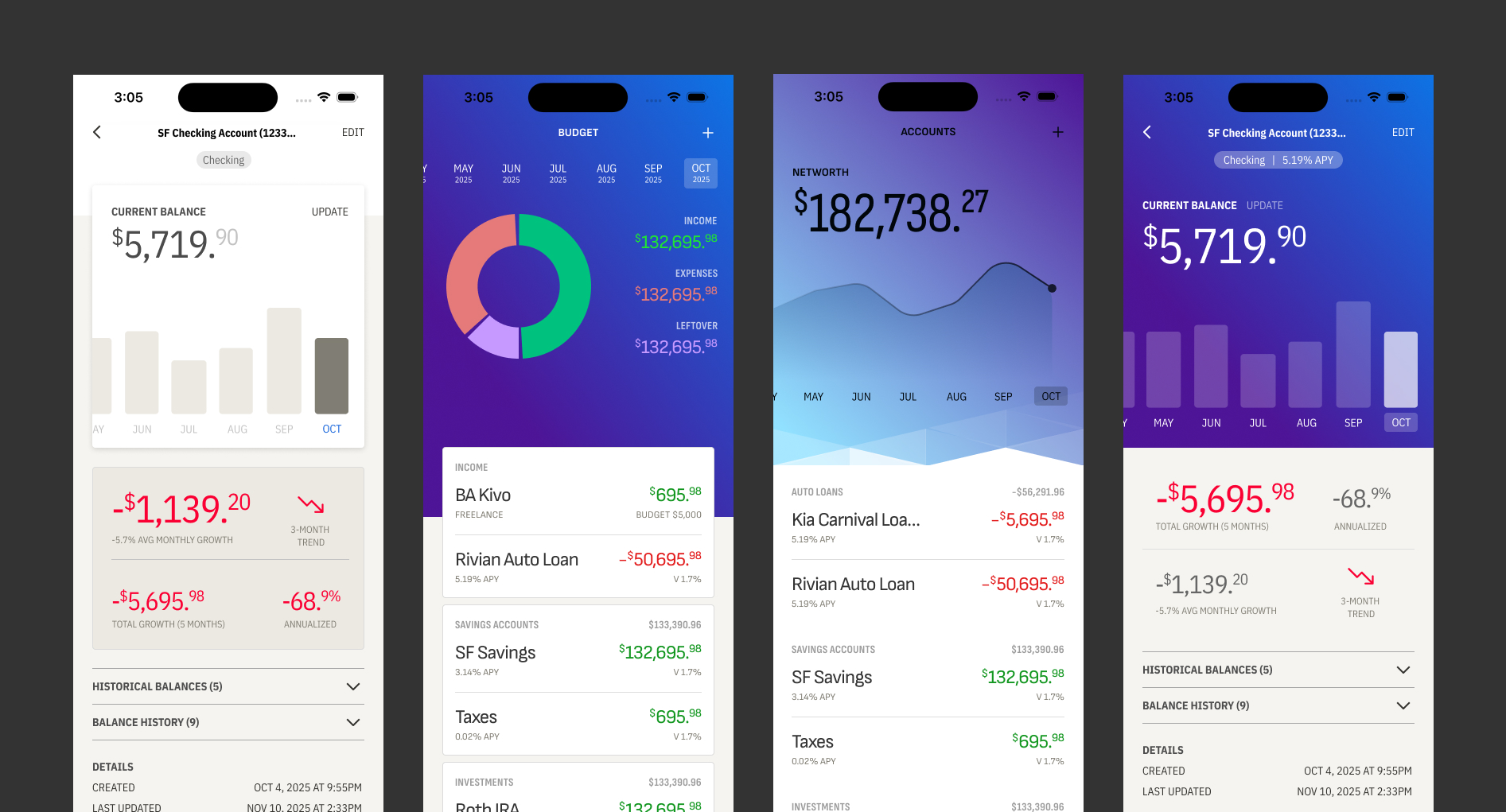
We pay for a budgeting app and I wanted to see if I could build one that matched how we actually budget. Every month, we look at our income, spending, and allocate any excess toward specific goals. That's the core loop, and most budgeting apps bury it under transaction categorization and other budgeting strategies.
Learning to Scope Down
Initially I wanted it to do everything. Full account integrations with Fidelity, Plaid, and bank APIs for automatic transaction pulling. I quickly learned that those integrations require significant backend infrastructure, security compliance, and ongoing maintenance that would consume all the time I wanted to spend on design.
I made a deliberate product decision to reduce the scope to focus on the big-picture budget numbers rather than individual transactions. Everything is manually tracked: account balances, income, expenses. No secure financial data is stored through third-party integrations. This constraint forced clarity around what matters most: where your money is going and whether you're hitting our goals.
Key Design Decisions
Monthly Budget Flow
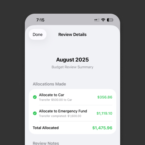
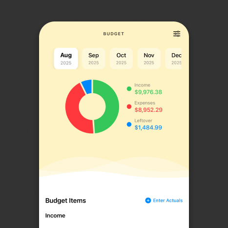
Each month, we walk through a guided flow: review our income, check our spending categories, see what's left over, and allocate excess toward goals. It mirrors how we actually sit down and budget together.
Goal Projection Modeling
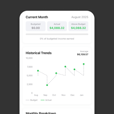
Every goal and account has projection modeling built in. You can forecast our savings rate for the house down payment or see when a car loan will be paid off based on our current allocation. A visual timeline that shows progress and motivates consistency.
Visual Language
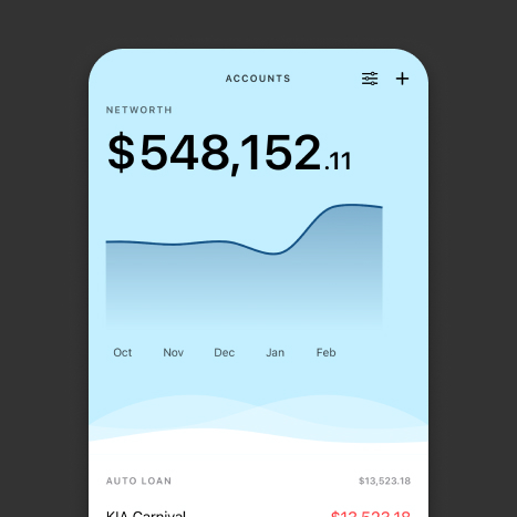
The design uses a light, airy palette with soft blue gradients. The net worth view is the hero screen, showing our overall financial picture with a trend line and account breakdown below. I explored multiple visual directions for how to display financial data without it feeling like a spreadsheet: large type for key numbers, subtle charts for trends, and clean card layouts for individual accounts.
The app has full iPhone and iPad support, with the larger screen real estate on iPad allowing side-by-side views of goals and budget status. The navigation uses a tab bar with Home, Goals, Budget, Accounts, and Settings, each representing a core mental model of how we think about their money.
Typography as Information Design
The net worth number uses large, bold type with cents rendered in a smaller weight. Account balances use red for debt and muted tones for labels. Percentage changes are sized and colored so you can glance at your phone and immediately know where you stand.
Intentionally Calming Palette
I chose soft blues and generous white space specifically because money is stressful. The wave gradient behind the net worth chart guides you down the screen and makes opening the app feel like checking in on progress.
Designed in Figma, Built with AI
Like all my side projects, Orchid Finance was designed in Figma and developed using Claude Code. Native Swift for iOS. The ability to design a screen, implement it, and test on a real device in the same day fundamentally changes how I approach product design. Decisions that used to be theoretical ("would a guided monthly flow actually feel better than a dashboard?") become testable within hours.
