As a Senior Product Designer and volunteer Design System Lead at Side, I updated and maintained a cohesive design system for the platform, ensuring UI consistency while increasing designer productivity. I led the initiative to migrate from Sketch to Figma, documented standards, and facilitated cross-functional collaboration. By addressing inconsistencies across various product codebases, our small team created a foundation that reduced complexity, enabled productive collaboration, and established a framework for continuous improvement.

Details
Component Inventory & Standardization
Conducted a comprehensive content inventory across all products, documenting every UI element, its location, responsive behaviors, interaction patterns, and improvement recommendations. This audit revealed significant inconsistencies across product codebases, informing our prioritization strategy for component updates.
Typography Refinement
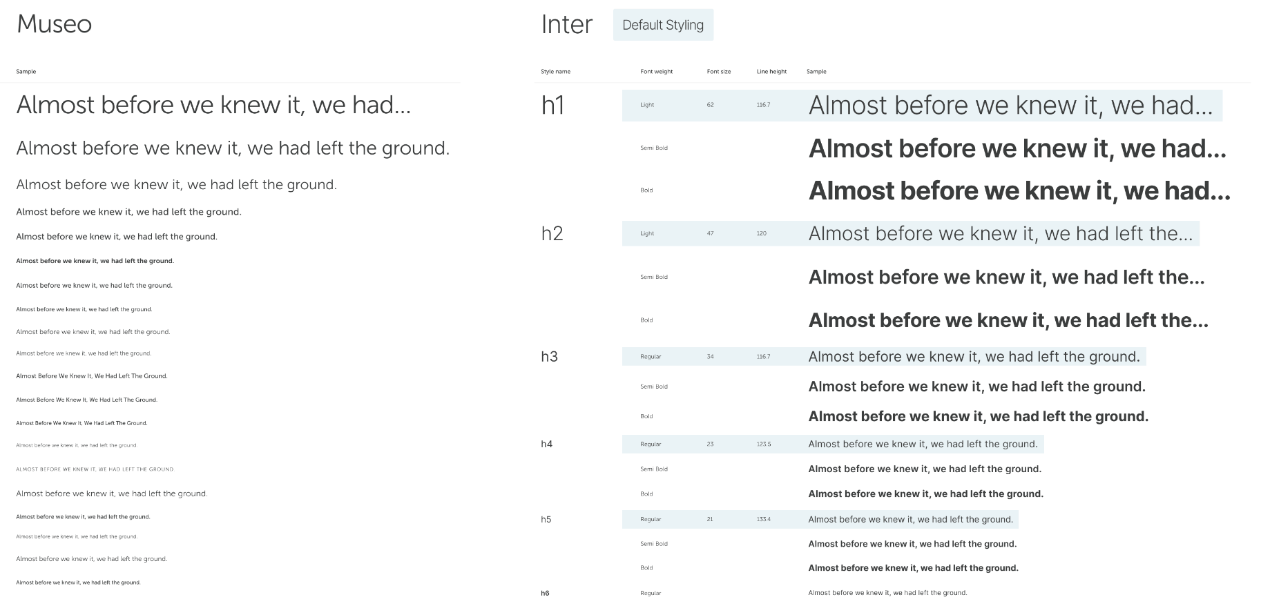
Identified performance and legibility issues with the existing Museo Sans font system. After multiple explorations, led the transition to Inter for its superior legibility, variable font support, and faster load times. Collaborated with engineering to implement the new typography system ensuring design and code remained synchronized.

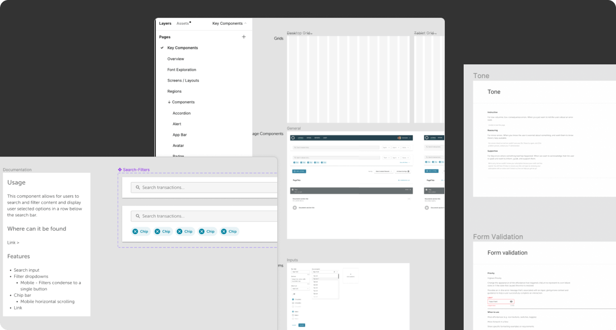
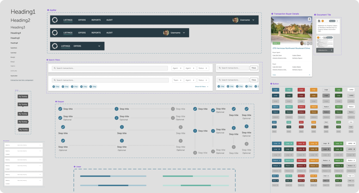
Figma component library showing standardized UI elements

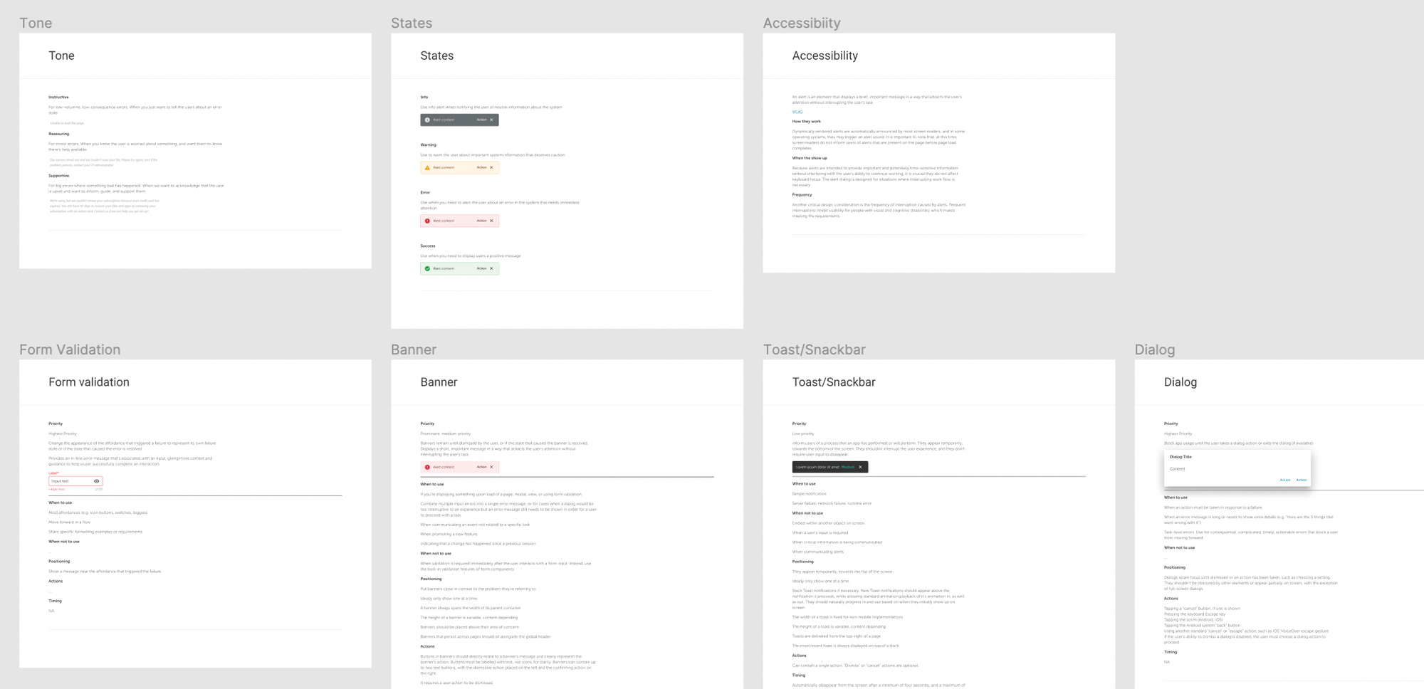
Detailed documentation for each component ensured consistent implementation

Revised typography system using Inter improved legibility and performance
Future Roadmap
Continuous Documentation & Refinement
The design system was planned as a living entity requiring active involvement in its growth and maintenance. Future work would involve continuously documenting and defining/redefining standards for each component as the product evolved.
Accessibility Enhancements
Accessibility was identified as a priority requiring support across all organizational levels. Plans included implementing systematic checks and standards to ensure compliance with accessibility guidelines throughout the product.
Organization-wide Communication
Plans included establishing regular communication channels such as a monthly or quarterly newsletter to update the organization about design system changes, new Storybook components, and upcoming design team initiatives.
