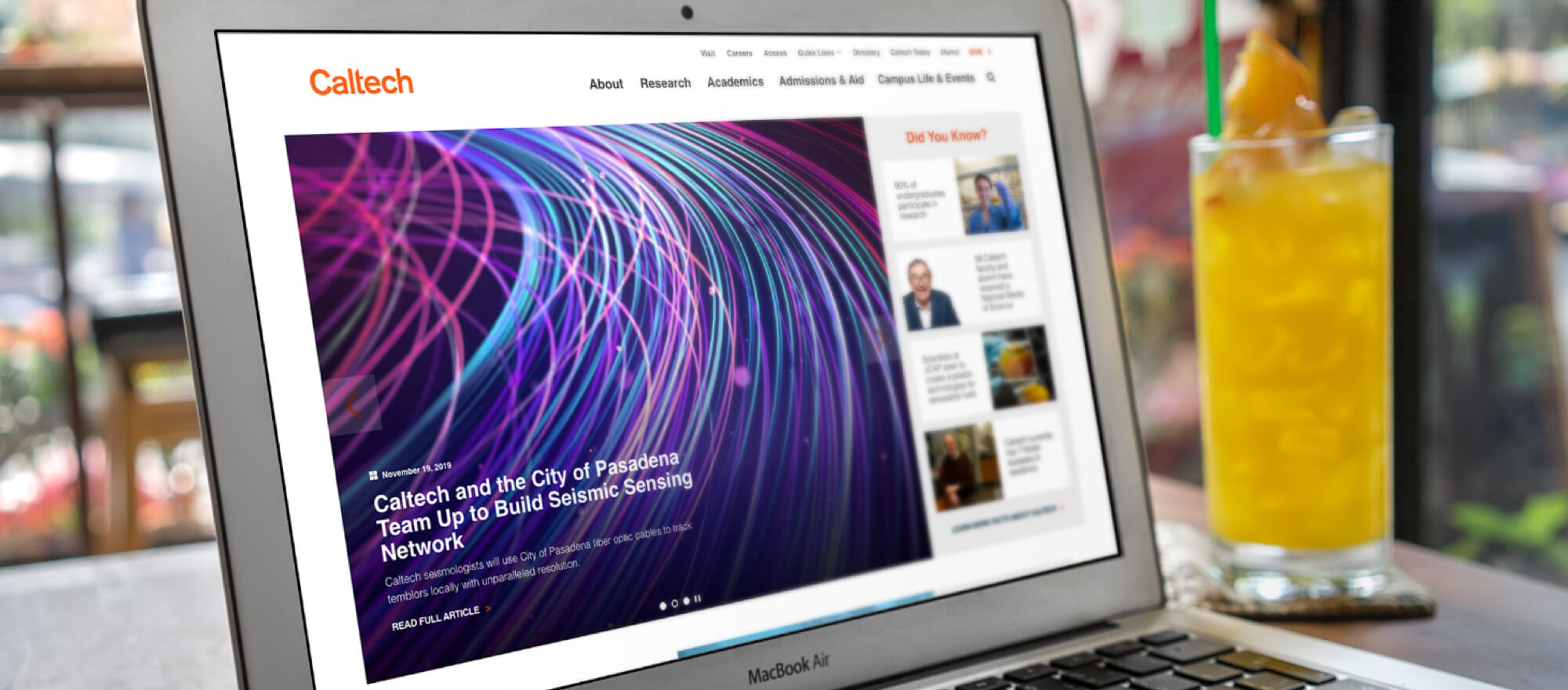
For years the Caltech website looked outdated and needed to be modern and clean. We focused on bring the amazing research and news to the forefront of the site.

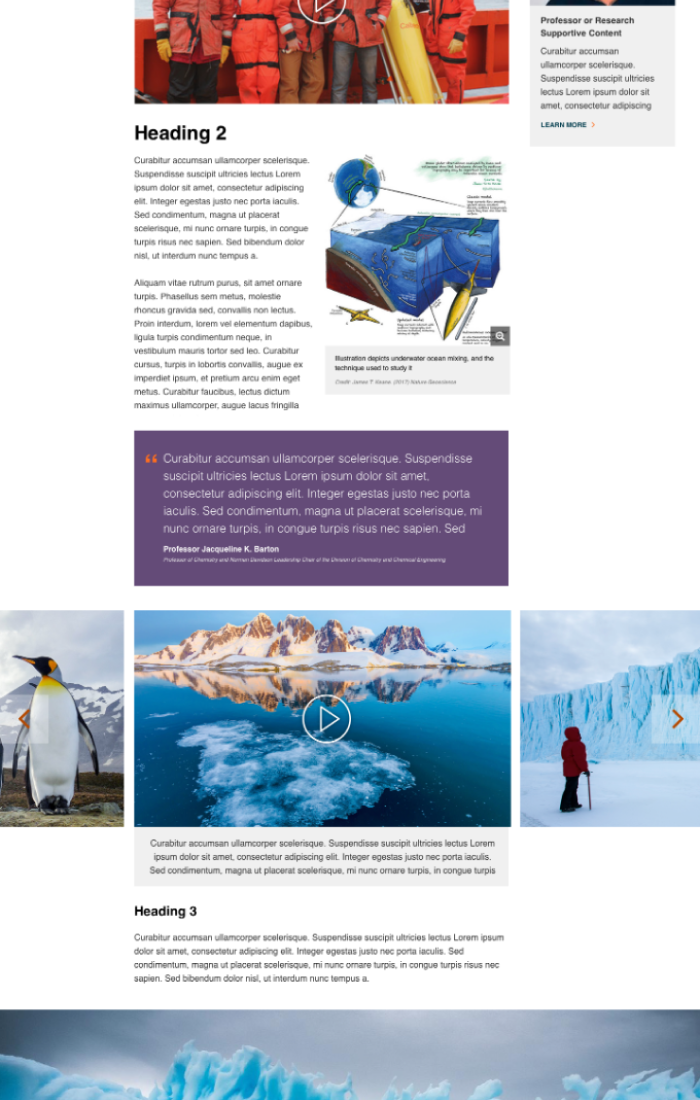

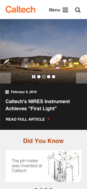


When describing the Institute Caltech’s president often says that “we punch above our weight.” Caltech’s impact is greater than its size. Some would say Caltech is a research institute that happens to have students. This positions them in a vastly different light then what we normally work within higher education.
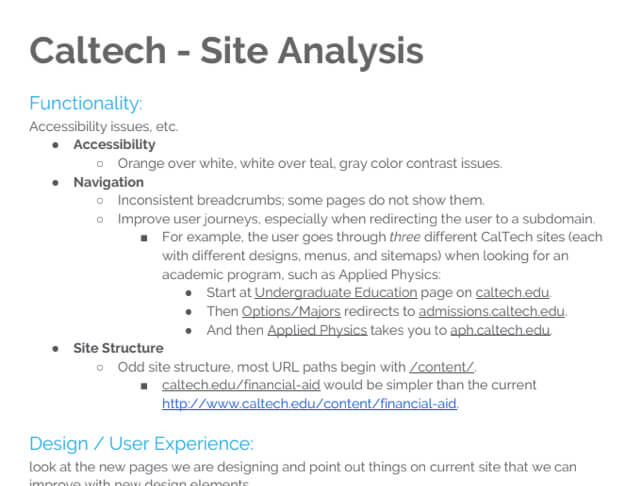
A quick overview of how their website was built and structured. We created a short report to outline where things could be improved. Gathered by Anthony (Design) and Fernando (Development).

Anthony from the design team took a deep dive into their Google Analytics. It was interesting to see the international attention they received and most clicks went towards articles.
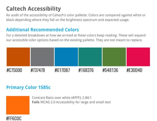
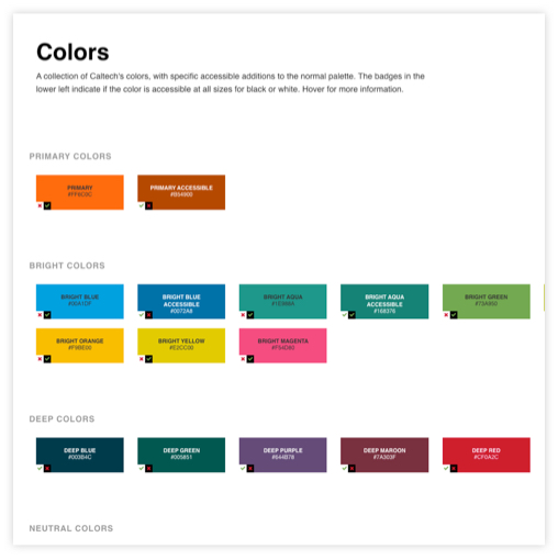
Their main site wasn't accessible, so one of our first steps was to look at their brand identity and make sure we could work with it properly. Orange is always a challenge, this was no exception.
Along with our analytics review, we dive into how we can rearrange their content and make the menu logical. We met with the Caltech team to discuss how this works out with each department. A couple of revisions and we were able to settle on a clear menu structure and style.

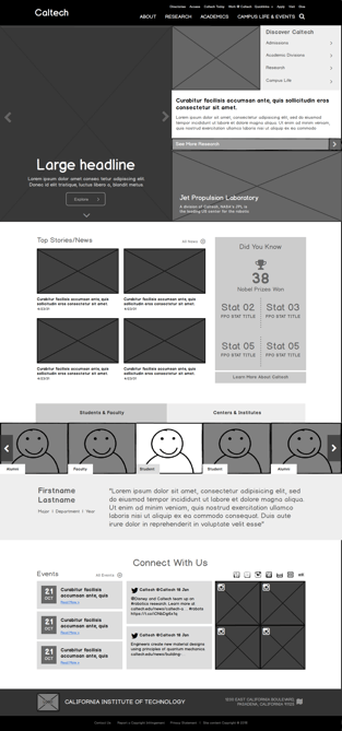
After our short research phase, we look that information and worked through sprints to understand Caltech's content and how to best display it. We were able to meet every other week to discuss changes and revisions. Wireframes were created in Balsamiq, we enjoy utilizing it as it simplifies content and we can focus on just layout and flow. Wireframes were uploaded and commented on in InVision for Caltech and KWALLs collaboration.

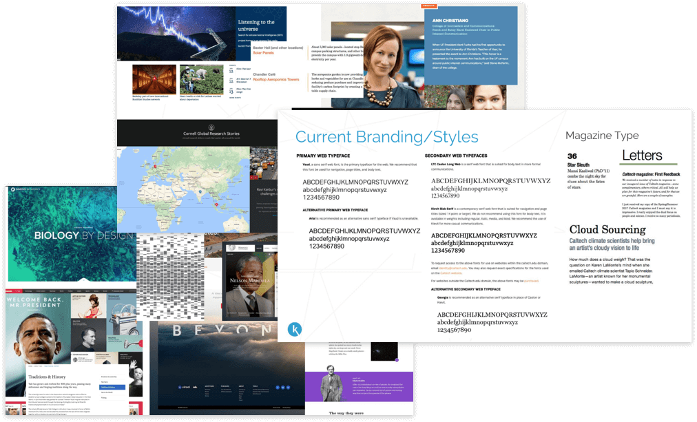
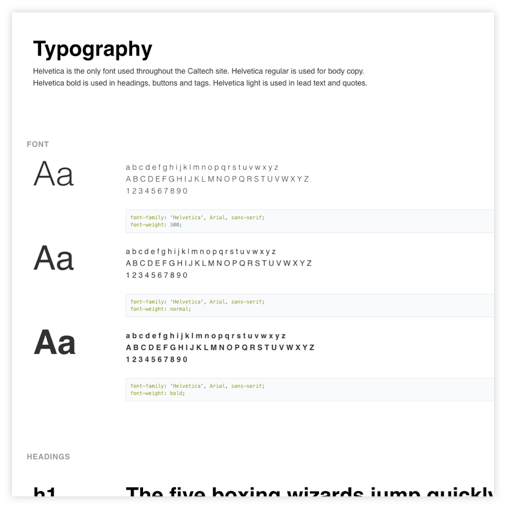
The KWALL design group got together to discuss what we felt reflected in the modern and research-focused institute. We got to walk around the campus to get a feel from the architecture and other patterns we could pull inspiration from. With help from the Caltech team as well we were able to put together some type styles and other editorial trends they used in their print work.
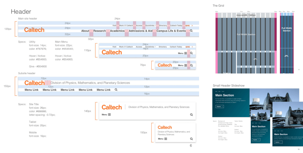
Since KWALL wasn't building the website, we outlined the spacing, attributes, and other values. A 60 something page outline of all the elements from the designs. Functionality is also described for many of the elements.
Similar to the design specs, we like to create a mini design system. Since we can't create a full design system for all of our clients with such short timelines. I created the first iteration of the style guide with simple HTML & CSS. Noah has since taken it and made it better and more detailed. This is our way of handing off some simple dev details from the designers. We outline colors, type settings, inputs, components, and other project-specific sections.


Working with such a great client I hope to look for more teams like that. They were very open to new ideas but also wanted to make sure that things were based on research. I wish we could have interviewed more people and worked with more departments to gain more insights. Since it's launch it has received numerous positive reviews and continues to grow.