The idea for an app that would provide medical facilities information about their energy consumption. How does the facility rank compared to other facilities and what recommendations could be made.
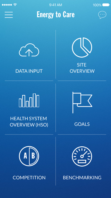

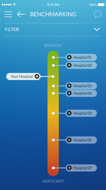
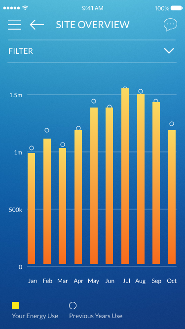
My role on this project was to create the style for a shareholder presentation. They wanted a design that was a little more out there (for 2017) and something that visually would be exciting for a presentation. I was able to collaborate with product and engineering leads to get a general idea for the app features and what would be reasonable to accomplish. It was a quick timeline and every limited budget with only 2-3 revisions and meetings before the designs were needed.
The focus was then put on key screens that would provide a quick overview of the information needed to adjust facility resources.
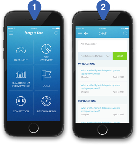
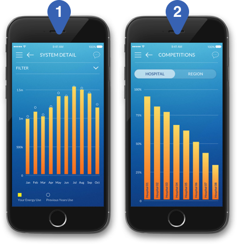
We focused on the current month view so adjustments could be made, as well as creating a facility comparison screen to see how you rank.
We created graphs that could be filtered and give the manager a sense of how they are tracking by year and by the facility.

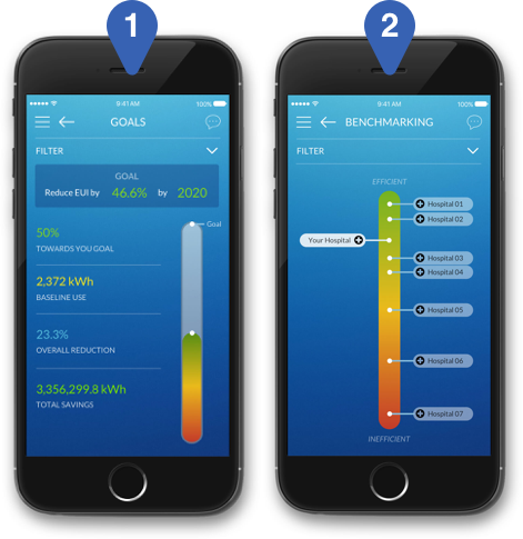
Setting goals and showcasing your progress in real-time provides managers with the information they need to keep on top of their planning.
It was fun to work on such a quick project but provided limited to no research. It's was a challenge to showcase the charts and filters in such a small screen space. It was also difficult to showcase an interactive app within a keynote presentation that I really had no control over how it would be shown at the end of the day. You can also check out the full ProtoPie prototype >
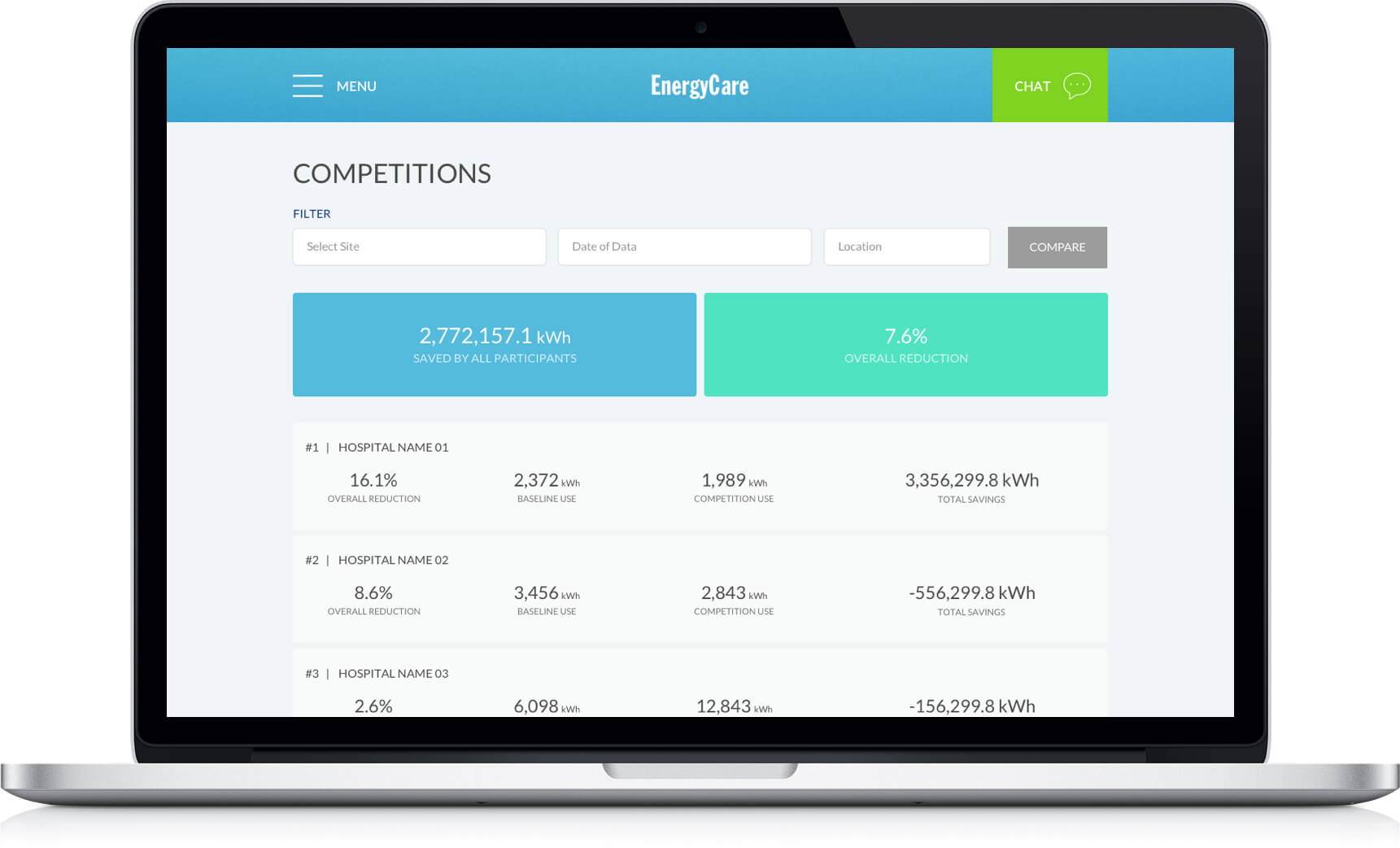
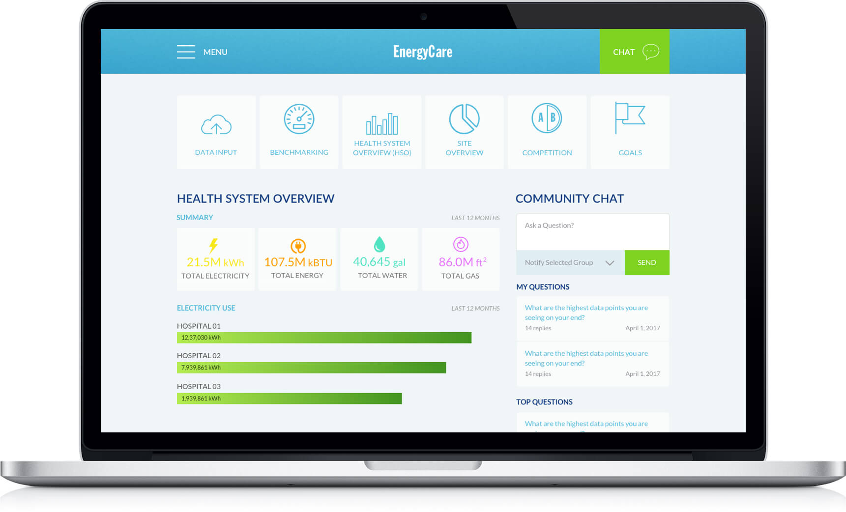
The desktop version was a lower priority for the group to see. The web app would be pulling from the same database generally displaying the information in the same way. Obviously, with the web version, we have a few more liberties to show more information with additional filters and comparison charts. The colors were adjusted to reduce the amount of blue saturation and keep elements simple.