As the Sr. Product Designer on the Growth team at Side, my role was to define what is possible on the web and deliver experiences that make our agent partners stand out. It involved defining layouts, customization options, and creating an editing experience that helps our partners look professional. Along with daily stand ups, I participated in our backlog grooming, sprint planning, and weekly design review sessions.
Brett A - Senior Product Designer
Melissa C - Director of Product Design
Joe N - Sr. Product Manager (2021)
Hayley G - Sr. Product Manager (2022)
Steven S - Lead Engineer
C Casper - Senior Engineer
Brett P - Senior Engineer
Monis - Engineer
Alex S - Engineer
Sebastian - Engineer Manager
Rodrigo - Engineer
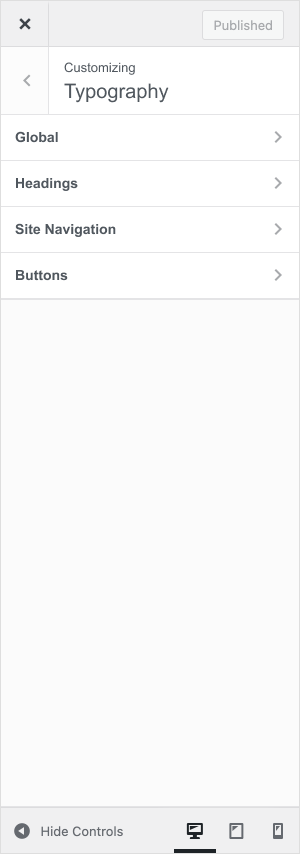
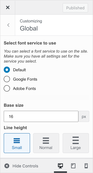
When I joined the team, I noticed our website offering was not flexible enough for our implementation team or agents to make the changes and adjustments they needed. Much of the WordPress template was constructed with custom-made blocks that had very few design options. I identified design gaps and introduced improvements to the color configurator, type options, and layout configurations to allow for more consideration of the overall art direction.
Our internal web implementation team and external partners were limited by the functionality of the current website platform editor. They wanted to be able to build unique layouts and page styles. Improvements to the editing experience are needed to empower the implementation team to customize partner sites to match their brand and content needs. This allowed them to feel that they were receiving a custom website tailored to their brand which decreased customization requests after launch and increased partner brand recognition.
Over the years Side had been collecting feedback from customers regarding how they would like to be able to personalize their websites. We sorted through customer and internal feedback to figure out the requirements needed for an improved editor experience. There were many different feature requests, therefore we listed out the main features, prioritized them, and concentrated on the ones that would make the most impact on their productivity.
During the requirements-gathering phase, we also looked at competitor products, conducted heuristic and design evaluations to identify additional areas, and watched recorded user research sessions. Much of the findings addressed content order, consistency of design elements, and accessibility. Working with our PM, we interviewed a handful of accessibility consultants and eventually partnered with one to get us up to WCAG 2.1 compliance. These evals were shared in a presentation to the leadership group to help communicate the areas of opportunities we have.
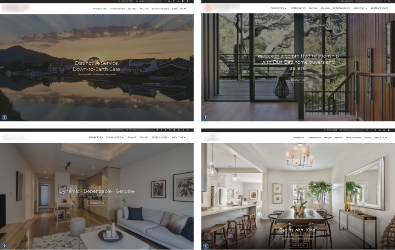
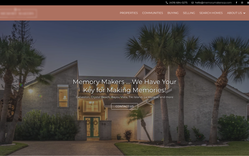
Our implementation team has been able to create more unique and custom layouts using the updated editing experience. Below are a few of the sites showcasing the new features. Credit for these designs go to the implementation team at Side.


With any public-facing website, we needed to ensure that our sites are WCAG compliant. My past experience with web accessibility and college websites was the foundation that I used to help push for a better user experience. One of the tools we created was a stand-alone web page that displayed text and buttons over different background colors. This was designed to help our partner branding team as they picked color pallets and helped set the expectation that certain colors would or would not work for the web. This also allowed our implementation team to utilize this tool while applying those brand colors and make any adjustments to meet proper color contrast ratios.
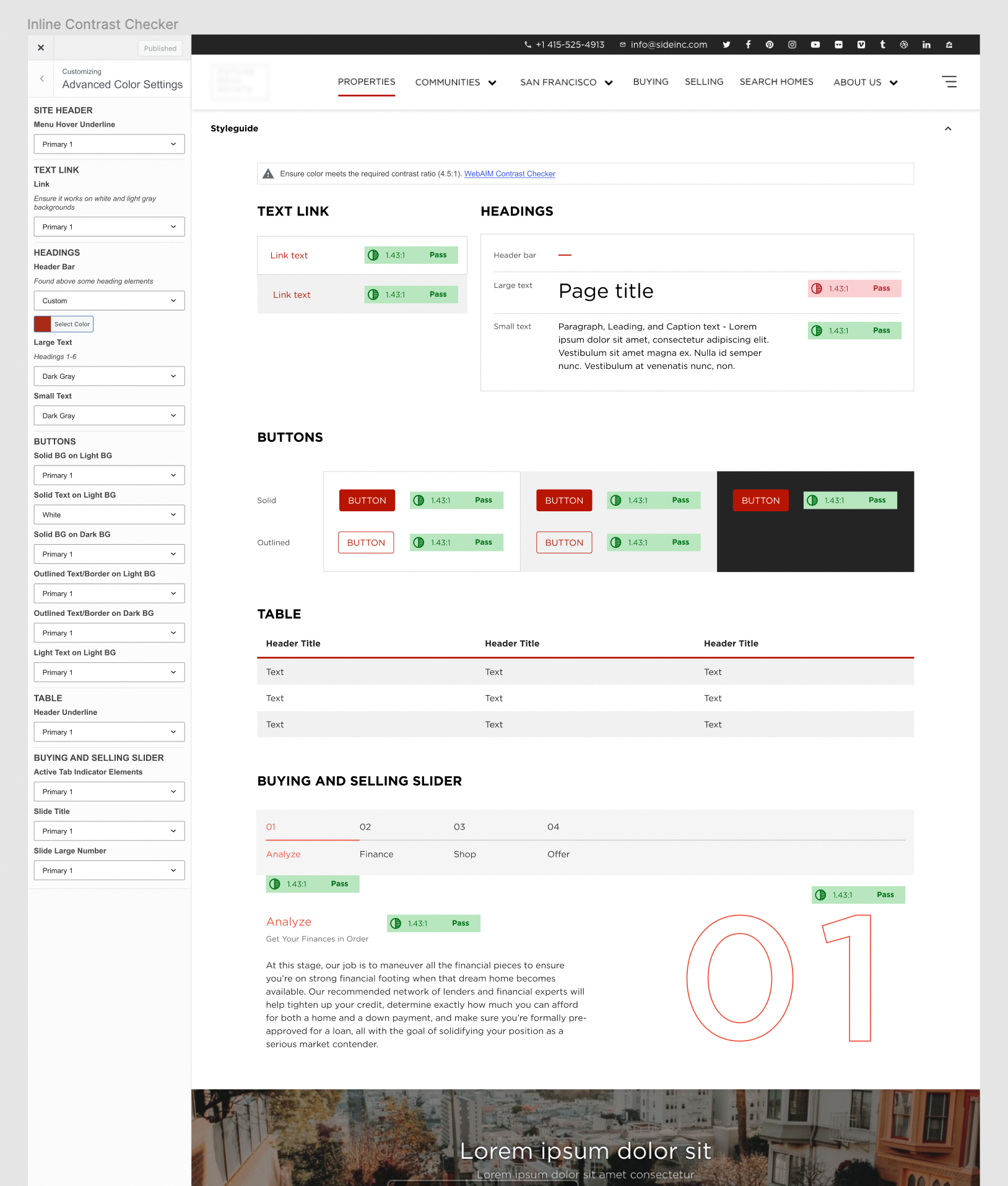
Phase 2 of the color check was to embed the checker into the customizing experience. This would show live updates and highlight problem areas to our team. This would also help point out other problem areas that the simple stand-alone checker could not account for.
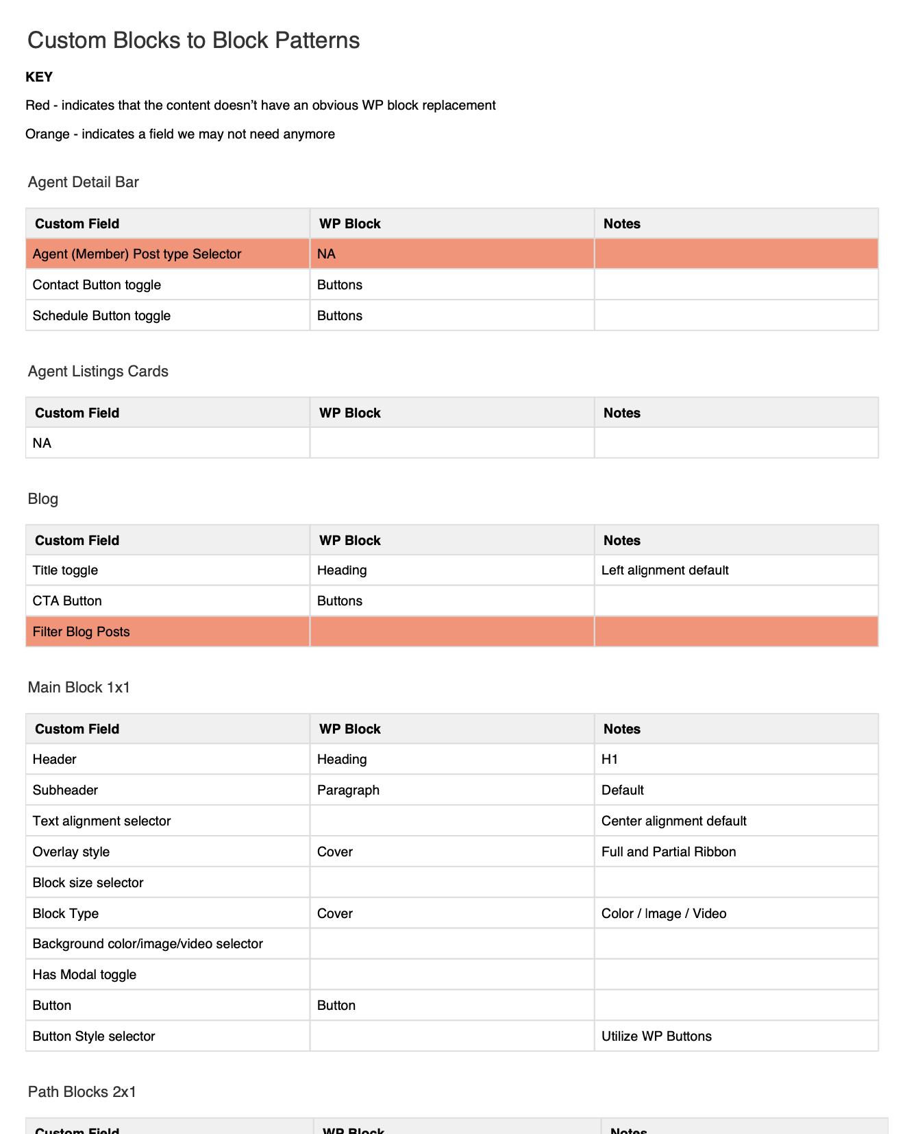
To help solve the lack of layout and content flexibility, we researched opening up most of the core WordPress blocks (headings, paragraphs, buttons, columns, groups, etc.). After weeks of design reviews and QA with the Engineering team, we were able to release a set of core blocks to our partner sites. The implementation team has been able to do some amazing designs with a new level of flexibility.
One of the frequent complaints we heard from partners was that all our sites looked the same in terms of the header and footer. You could always tell a Side partner site by the white header and dark footer. We spent a long time researching and talking to our editors to find out what were problem areas and the results they were striving for. We scoped this out and have been actively implementing them in each sprint since.
Here are a few of the features we introduced to the customizer:



As our partner needs have expanded into new markets, the need for more flexible property pages is a must. They need to be able to not just handle single property data, but leases, rentals, multifamily, etc.
The second initiative on the roadmap is working on lead generation, allowing partners to include custom pop-ups, contact walls, chat windows, and increased data collection methods throughout the site.
The needs of our internal implementation teams have changed and their ability to support more advanced design layouts is crucial to the success of the website launching. As mentioned earlier, I created the migration plan for us to change most of our custom fields to default WordPress blocks.
This was an interesting project that required time management, project management, and "working with ever-changing requirements/feature scoping as they occurred" skills. It was also an exciting opportunity to implement changes to the customizer and open up options for new layouts that had previously been very restricted.